




































If a property search API only uses miles, it misses the part buyers care about most: commute time. I’d sum up the article like this: use seven commute signals – drive-time bands, transit access, job access, peak-hour travel time, route options, congestion, and a combined access score – to rank homes by how a trip works on a normal day, not just by how close a pin looks on a map.
Here’s the core idea in plain English:
- A home 12 miles away can be a better fit than one 6 miles away if the trip to work is shorter.
- Radius search shows proximity. Commute search shows travel time.
- The best API setup uses:
- hard filters first: drive-time band, transit stop distance
- ranking second: commute score, job access, congestion
- small field sets: minutes, counts, scores, and route options
- The article covers 7 signals that turn commute data into API fields teams can filter, sort, and audit.
For me, the big takeaway is simple: use time to filter, not just distance. That gives buyers a search result that matches how they live.
Quick Comparison
| Signal | What it tells you | Best use in search |
|---|---|---|
| Drive-time bands | Whether a home fits a 15–60 minute trip | Early filtering |
| Transit stops and service | Whether transit is close and usable | Transit-based filtering |
| Job access | How many work hubs are reachable | Ranking by work access |
| Peak travel times | What the trip looks like during rush hour | Commute-window filtering |
| Route options | How many ways a trip can work | Sorting by flexibility |
| Congestion and reliability | How steady the trip is day to day | Ranking consistency |
| Composite access score | One score built from all signals | Final sorting |
I’d read the article as a guide for turning a property API from a map search into a decision tool.
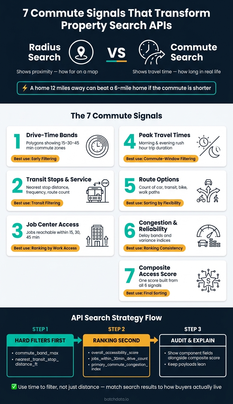
7 Commute Signals for Property Search APIs: Distance vs. Time-Based Search
Why Commute Signals Belong in Property Search APIs
Commute data belongs in a property search API for a simple reason: it answers the question buyers care about most: "How long will it take me to get to work?" That makes commute signals a smarter search layer than radius alone.
Distance-Based Search vs. Time-Based Search
A distance-based search uses a fixed radius in miles or feet. Time-based search uses travel time instead. So a home 12 miles away can still make the cut if the commute fits the buyer’s target window.
That’s the key difference. Distance tells you how far a property sits on a map. Time tells you what day-to-day life might look like.
How Commute Data Maps to API Fields
Commute inputs start to matter when you store them as filterable API fields tied to each property record. A drive-time band might live in peak_drive_minutes, transit proximity in nearest_stop_ft, and job-center access as a count of employment nodes reachable within 30 minutes.
Lean, consistent fields keep commute search fast. They also make it easier to turn buyer intent into actual filters instead of vague map-based guesses.
As Ivo Draginov of BatchData says, API fields work best when they match the question buyers are trying to answer.
From here, each signal can be exposed as its own filter. This article walks through seven of them, starting with drive time bands. The first signal is drive time bands, which turn commute time into a searchable filter.
sbb-itb-8058745
1. Drive Time Bands
A drive time band is a polygon that shows which properties fall within a 15-, 30-, or 45-minute commute to a destination. It’s searchable commute geography, not just a basic radius. That difference matters because a polygon follows roads and accounts for real barriers that a simple circle ignores.
In a real estate API, drive time bands can filter properties and return counts or aggregates before you pull full records. So you can answer the buyer’s main question – does this property fit my commute target – before making a heavier data request. That’s why drive time bands should be the first commute filter you apply.
You’ll also want to refresh bands as routing data changes instead of treating them like fixed outputs. After that, add transit stops and service levels for buyers who don’t drive.
2. Transit Stops and Service Levels
A transit-stop field answers a basic question: can someone use transit from this property without a headache? A nearby stop may look good on paper, but if service barely runs, that stop does not do much. The main fields to show are nearest stop distance, stop type, route count, service frequency, and first and last departures. Those details separate actual access from simple proximity.
A plain radius can also get this wrong. A stop may sit close by, but roads, rivers, or other barriers can make the trip far less direct than it seems. In those cases, a custom polygon gives a more accurate picture of access.
Transit data shifts all the time. Route suspensions, weekend service cuts, and peak-hour frequency changes can quickly alter whether a stop is useful day to day. Refresh transit data as service changes. Pull from multiple feeds so one slow source does not leave holes in the data. That turns transit from a basic stop signal into something more practical: a way to judge access to job centers.
Keep the payload tight: return only stop distance, type, frequency, and route count.
Next, job centers show whether those stops connect to where buyers actually work.
3. Job Centers and Employment Access
Transit tells you how buyers can move around. Job-center data tells you where that trip needs to end.
That matters because transit access on its own doesn’t say much about work access. A job center field shows how close a property is to a downtown core, office district, or employer campus, and how long it takes to get there.
When a metro boundary slices through major employment areas, use market-specific polygons. That keeps the data lined up with the places people are actually commuting to, not just with an arbitrary map edge.
For API teams, a few fields tend to do the heavy lifting:
nearest_job_center_minutesjobs_within_15_minjobs_within_30_minjobs_within_45_min- mode
Be explicit with field names. It keeps listings ranked against the right work destination at the neighborhood level. It also makes the data easier to use in search and sorting.
You should also expose these fields as filters, so buyers can compare listings based on actual job access, not just straight-line distance.
Next, peak travel times show how access shifts by hour.
4. Peak Travel Times
Peak travel times show how long a trip takes during the busiest departure windows. Once the destination is locked in, departure time is the next thing that changes the result. Use fixed peak windows across listings and markets so the numbers stay comparable.
For field representation, keep the structure tight and predictable. A lean payload built around a specific departure time is faster to request and easier to parse downstream. Useful fields include:
peak_morning_minutespeak_evening_minutesoff_peak_minutesdeparture_timemode
Make these fields filterable and sortable for commute-based ranking. That way, search workflows can surface listings by travel time at set departure times instead of mixing everything together.
Refresh peak travel times after route or schedule changes. Use historical averages for benchmarking, and reserve near-real-time conditions for routing workflows.
Next, route counts and multimodal options show how many commute paths buyers can rely on.
5. Route Counts and Multimodal Options
Route count matters only if people can actually use those routes. A big number looks nice on paper, but if the paths are awkward, slow, or incomplete, it doesn’t help much.
In a property search, route count shows how many commute paths exist between a listing and a destination by car, transit, bike, or walking. That gives buyers and renters a clearer sense of how much flexibility a place offers beyond a single go-to route.
Don’t show route data as just one total. Break it out into fields like:
- supported modes and route count by mode
- transfer count
- first-mile and last-mile coverage
First-mile and last-mile coverage matters most in transit-heavy searches. It shows whether the trip works from start to finish, not just in the middle.
Supported modes and route counts can also work well as filters. Keep payloads small and consistent so queries stay fast and parsing stays simple.
Treat route-count and multimodal fields as computed data. Refresh them when routing inputs change.
Next, congestion levels show whether those routes stay reliable at peak times.
6. Congestion Levels and Reliability Indices
Congestion and reliability tell you something simple but important: can this commute still work when timing matters? That changes the focus from basic route availability to day-to-day consistency.
For API field representation, store these signals as bands or scores, not raw minutes, using data-driven property services. And tie congestion data to the same commute boundary used for ranking, so it lines up with the rest of the search workflow.
Refresh congestion fields when the data changes, not on a fixed schedule. Then surface:
- delay bands
- reliability scores
- variance indices
That gives buyers a clearer view of how conditions change across different departure windows.
These signals should rank listings by commute consistency, not just top-line speed. A home with a 28-minute drive time but high variance can rank below one with a 32-minute drive time and steadier reliability. That’s the point. Congestion and reliability help separate listings that look almost the same if you only compare drive time. These measures also feed the composite accessibility score in the next signal.
7. Accessibility Scores and Composite Commute Indices
An accessibility score rolls drive time, transit, job access, congestion, and walk distance into one ranked value for each listing. In practice, it pulls the six earlier commute signals into a single output. That makes it handy for ranking, but it shouldn’t replace the underlying commute fields.
Build the score using the same search boundary as the fields underneath it. If you switch to a circular search area, access can look better than it is.
The score only helps if people can inspect what went into it. So don’t return one opaque number by itself. Show the component fields next to the composite score, so users can see what’s driving the result. And when the source inputs include uncertainty, include low and high bounds too. That keeps the range of evidence visible instead of pretending the number is more exact than it is.
Refresh the score whenever any input signal changes. Use the composite score as the final ranking layer, then expose the underlying fields for filtering and auditability.
Use the score to rank; use the underlying fields to filter.
How API Teams Can Put These Signals to Work
After you rank places by accessibility, expose the fields behind that ranking so teams can filter, sort, and audit the results.
Core Commute Fields to Expose
Expose each commute signal as one filterable field, and keep responses narrow.
| Field Name | Signal | Use For |
|---|---|---|
commute_band_max |
Drive time band | Filtering by drive-time band |
nearest_transit_stop_distance_ft |
Transit stop proximity | Filtering by distance |
jobs_within_30min_drive_count |
Job center access | Ranking employment access |
morning_commute_time_min |
Peak travel time | Filtering by commute window |
feasible_routes_count |
Multimodal route options | Sorting by route flexibility |
primary_commute_congestion_index |
Congestion reliability | Filtering by reliability |
overall_accessibility_score |
Composite index | Final ranking layer |
Use commute_band_max and nearest_transit_stop_distance_ft as hard filters to shrink the candidate set early. Then use overall_accessibility_score as the sort key. That score orders the results, while the other fields show why one place ranks above another.
Fields like morning_commute_time_min and primary_commute_congestion_index help when search needs to match a normal morning trip, not just a simple map distance. That matters because a 20-minute trip on paper can feel very different during rush hour.
Storage Formats for Fast Queries
Once the fields are set, the next step is storage that keeps filtering fast.
Store drive-time polygons as GeoJSON for spatial queries. Keep numeric score fields like overall_accessibility_score, primary_commute_congestion_index, and feasible_routes_count as precomputed indexed columns. That setup lets APIs return counts and aggregates without full records. For interactive search, use paged JSON to keep latency low.
Precompute vs. On-Demand Routing
The practical split is simple: precompute what gets used often, and call live routing only when the query is very specific.
Precompute drive-time bands, job access counts, and composite scores for portfolio analysis and research at scale. Refresh those fields when routing inputs change. Use live routing on demand for edge cases or one-off checks. In day-to-day API flows, precomputed fields handle filtering and ranking, while on-demand routing fills in the exceptions.
Comparison Tables for Each Signal Type
These tables show which commute signal fits each search task. Use them to decide which commute field to expose, rank, or show first. Start with the signal that lines up with the buyer’s question.
Distance-Based vs. Time-Based Search
| Dimension | Distance-Based Search | Time-Based Search |
|---|---|---|
| What It Measures | Physical proximity, using a radius or custom polygon | Accessibility measured in minutes or isochrones |
| Primary Strength | Precise for neighborhood-level valuation and comparable sales | Reflects actual trip time |
| Primary Weakness | Can miss traffic, transit gaps, and congestion | Varies by time of day and is more computationally intensive |
| Best Use Case | Appraisals, investment buy box matching, and local market analysis | Commute planning, relocation research, and tenant acquisition |
| Best Fit For | Site selection teams, appraisers, and investors | Residential buyers and renters |
Distance-based search answers a simple question: How close is it? Time-based search answers a different one: How long will it take? That distinction matters more than it may seem at first glance.
Transit Distance vs. Route Count vs. Transit Access Score
Stop distance shows access, route count shows redundancy, and a transit access score gives one sortable score.
| Signal | What It Measures | Strength | Limitation |
|---|---|---|---|
| Transit Stop Distance | Distance to the nearest stop or station | Simple to filter | Does not show frequency or broader coverage |
| Route Count | Number of distinct routes available | Shows flexibility and fallback routes | Does not reflect service quality on its own |
| Transit Access Score | Composite score that summarizes overall transit access | Gives you one sortable number | Less transparent than the underlying inputs |
Use stop distance for proximity checks, route count for flexibility, and a transit access score when you need a single ranking field. Put another way, each signal tells a different story. A nearby stop sounds good, but if it serves one weak route, the rider’s options may still be thin.
City-Center Proximity vs. Job Accessibility
City-center distance is not the same as reachable jobs. Downtown proximity is a location proxy; job accessibility is a commute proxy.
| Dimension | City-Center Proximity | Job Accessibility |
|---|---|---|
| What It Measures | Distance to the city center | Jobs reachable within a defined commute window |
| Reflects Labor Market? | Not reliably | Yes, because it can capture distributed employment |
| Best For | Urban walkability scoring | Relocation research and workforce housing analysis |
| Risk of Misuse | Can overstate access in polycentric metros | Can understate access if the commute window is too narrow |
This is where a lot of teams get tripped up. Being close to downtown does not always mean better access to work, especially in metros where jobs are spread across many hubs.
Off-Peak vs. Peak vs. Stable Planning Estimate
Use the metric that matches the search stage.
| Metric | Best Fit | Why |
|---|---|---|
| Off-Peak Travel Time | Browsing and initial filtering | Provides a lower-stress baseline |
| Peak Travel Time | Commute matching and alerts | Reflects the trip buyers and renters usually care about most |
| Stable Planning Estimate | Longer-term decision-making | Useful when you want a stable estimate that can withstand day-to-day variation |
Early in the search, people often want a simple baseline. Later, they care more about the trip they’ll face on a normal workday. And when the goal is planning, not browsing, a steadier estimate can be the better pick.
Single-Route vs. Multi-Route Options
More routes mean more fallback options.
| Configuration | Resilience | Flexibility | Typical User Benefit |
|---|---|---|---|
| Single Route | Low | Limited | Works when service is reliable and consistent |
| Two Routes | Moderate | Some backup | Helps when one option is unavailable |
| Three or More Routes | High | More flexibility | Supports car, transit, bike, and walk trips |
A single route can work fine – until it doesn’t. Once delays, closures, or missed connections show up, backup options start to matter fast.
Congestion Index Ranges
Congestion labels should be easy for buyers, renters, and product teams to interpret.
| Index Band | Interpretation | Practical Impact |
|---|---|---|
| Low | Free-flowing; minimal delay | Commute times are usually predictable |
| Moderate | Light to moderate congestion | Add a small buffer during peak periods |
| High | Heavy congestion | Travel times can vary noticeably |
| Severe | Persistent congestion and unreliable travel | Surface alternative routes or transit options |
Map these bands to plain labels in your API response.
With the signal types separated, the final step is choosing the one that best fits your query.
Conclusion
A property search API that leans on radius-only search misses a big part of the story: the actual commute. Straight-line distance may look neat on a map, but it doesn’t show what a trip feels like in practice.
The seven signals here – drive time, transit access, job access, peak timing, route options, congestion, and accessibility scores – paint a much better picture of commute burden than distance alone.
No single signal can do the whole job. Each one answers a different part of the commute question. Put them together, and buyers, renters, investors, and operators can judge a property based on how the commute works in real life.
Show only the signals that match the search intent, keep payloads lean, and make the output easy to explain.
Where to Start
Once the signals are set, the next move is deciding what to expose first. Begin with distance filters and geographic boundaries. Then add drive-time bands and transit fields. After the base search is stable, layer in peak times, route counts, congestion, and accessibility scores.
The best property search API ranks by commute fit, not just map proximity.
FAQs
How often should commute data be refreshed?
Refresh commute data as often as your analysis needs, so decisions rest on current evidence.
Instead of leaning on static, occasional reports, BatchData supports continuously refreshed workflows. That keeps signals like congestion levels and access scores accurate as conditions shift.
When should APIs use precomputed fields versus live routing?
Use precomputed fields for high-frequency, predictable queries when performance and cost efficiency matter. They give you a lean, consistent payload that’s faster to parse and easier to model.
Use live routing when real-time accuracy matters and results need to reflect current conditions, not static snapshots. BatchData’s documented platform supports both approaches through a unified data model.
How should teams weight the composite access score?
Weight it around the needs of your deal or platform, so you decide what counts as a strong commute signal instead of leaning on a pre-calculated number.
Skip opaque black-box metrics. Build the score from verifiable, granular data points, and show the parts behind it so the results are easier to explain and trust.


