
If I want an early read on housing demand, I look at app behavior before I look at closed sales. Search filters, map moves, saves, repeat views, and contact clicks can show where demand is building, where buyers hit budget limits, and when renters or buyers move from browsing to action.
Here’s the short version:
- Search filters show demand early. Price caps like $400,000, common setups like 3 beds / 2 baths, and school-based searches can point to budget pressure and family demand before sale data comes in.
- Location behavior shows tradeoffs. When users widen a map, draw a larger area, or push a search radius to 20 to 50 miles, that often means they want more inventory or more space.
- Session edits matter. A jump from $500,000 to $575,000 usually means the first budget did not return enough options. A switch from buy to rent points to a bigger reset.
- Engagement beats raw views. Saves, shares, alerts, repeat visits, and tour requests are stronger signs than simple clicks. For example, listings with 5+ saves per day in week one often move fast, and 10+ saves per day can line up with above-list outcomes.
- Behavior changes by segment. Buyers in high-cost markets use tighter map tools and alerts. Renters move fast on availability. Investors scan many ZIP codes and care more about price, rent, and days on market than school zones or layout.
- Bad data can distort the read. A condo tagged as a single-family home, stale status updates, or off-target school boundaries can skew filter and engagement patterns.
Quick Comparison
| Signal Area | What I Watch | What It Often Means |
|---|---|---|
| Search filters | Price, beds, baths, home type, square footage | Budget limits, home-size needs, property preference |
| Location inputs | ZIP codes, neighborhoods, schools, map draws, radius | Where demand is stacking up |
| Search changes | Budget increases, wider radius, filter removal, rent/buy toggle | Compromise, inventory shortage, or affordability stress |
| Listing engagement | Dwell time, repeat visits, saves, shares | Stronger interest than browsing alone |
| High-intent actions | Alerts, mortgage tools, contact requests, tours | User is closer to a decision |
| Data quality | Listing type, status, geospatial accuracy, contact records | Whether behavior data can be trusted |
Put simply: search behavior is less about what people say they want and more about what they do when choices get tight. That’s the lens I’d use for product, market tracking, and housing-demand analysis.
Search Filters and Query Patterns as Demand Signals
Search filters show what buyers and renters want right when they search. And when the same filter combinations keep showing up, those patterns start to tell a bigger story about demand by metro, ZIP code, and price band.
Price, Beds, Baths, Square Footage, and Home Type Filters
In U.S. real estate apps, the filters people use most often are max price in USD, bedroom count, bathroom count, property type, and sometimes minimum square footage. Price, beds, and property type usually appear up front. Square footage, lot size, year built, and HOA fees often sit inside a More filters panel that people open once they know what they want.
When search activity keeps clustering around the same settings – say, 3 beds / 2 baths, at least 1,750 sq. ft., and a max price of $600,000 – that combo forms a demand band. Platforms can watch those bands from week to week. If searches for 3-bed single-family homes under $400,000 jump while listings in that range stay flat, analysts read that as rising affordability pressure and tougher competition for a small pool of homes.
A Bay Area housing search study found that bathrooms are specified more often than bedrooms or square footage. That matters because it suggests bath count works as a shorthand for how livable or roomy a home feels. The study broke the region into 564 sub-markets and found that search patterns tied to geography, price, and size lined up with later market results.
Property-type filters sharpen the picture. Repeated searches for single-family homes with a minimum lot size of 0.15–0.25 acres and 3+ bedrooms point to long-term, family-focused demand. In urban cores, repeated searches for 2-bed condos under $800,000 with at least 1,200 sq. ft. point to demand for larger, higher-end units. Zillow data also shows more searches for ADUs, duplexes, and in-law suites. Researchers tie that pattern to multi-generational living and the appeal of rental income.
From there, location inputs show where that demand is piling up.
Location Behavior: Neighborhoods, ZIP Codes, Schools, and Map Tools
If filters show what users want, location tools show where they want it. When a big share of sessions in a metro keeps targeting the same ZIP codes, with tight price ceilings and high engagement, analysts treat that as a concentrated demand signal. As filters get tighter, location choices usually do too.
School-rating filters are one of the clearest signs of family demand. When sessions keep combining school-quality overlays with 3+ bedroom minimums and mid-range price caps, those ZIP codes get tagged as family-demand areas. School quality doesn’t change much from month to month, so if search volume rises under those limits, it can come before price pressure as more families chase a limited set of homes in those districts.
Map behavior adds another clue: how far people are willing to stretch. In metro cores, users usually search by neighborhood name or a central ZIP code and rarely draw large polygons. In the suburbs, that changes. Users start drawing broader polygons or setting commute limits, such as homes within a 25-mile radius or within a 30-minute drive of work. Realtor.com lets users expand their search radius from 0 to 50 miles, and shifts in that radius spread can show when demand is moving from urban cores into commuter suburbs.
Filter Types and What They Signal: Comparison Table
The table below sums up common filter patterns and what they usually point to.
| Filter Type | Example Behavior | Likely Demand Signal |
|---|---|---|
| Max price (USD) | Repeated searches capped at $400,000 despite higher inventory | Affordability pressure |
| Bedroom count | Consistent 3-bed filter in suburban ZIP codes | Household size demand |
| Bathroom count | 2+ bath filter applied more often than sq. ft. | Livability expectations |
| Min square footage | ≥1,750 sq. ft. threshold set repeatedly | Minimum space demand |
| Property type: SFH | Single-family filter + lot size ≥0.15 acres | Stable-family demand |
| Property type: condo | 2-bed condo filter in urban core under $800,000 with ≥1,200 sq. ft. | Higher-end urban demand |
| School-rating layer | School filter + 3 beds + $350K–$550K cap | School-driven demand |
| Commute-time radius | 30-minute drive filter from a downtown employment center | Suburban commuter pressure |
| Draw-on-map / radius | Polygon drawn 20–30 miles from city center | Affordability or space trade-off |
| ADU / multi-family type | Duplex or in-law suite filter in high-density ZIP | Multigenerational or rental-income demand |
How Search Intent Shifts Across the User Journey
Search intent doesn’t stay fixed during a session. It moves. Most people begin with a broad search, then narrow things down as they weigh options. And as that search gets tighter, listing behavior becomes the clearest clue about what they want.
From Wide City Searches to Specific Listing Criteria
Most sessions start with a city-level search and very few filters. From there, users usually tighten the criteria: narrower price ranges, set bedroom counts, and more exact location lines. That move from casual browsing to active shortlisting shows up again and again in real estate app behavior data.
The opposite pattern shows up too. When results are too thin, people often loosen filters instead of dropping off. They might remove a school filter, bump up the price cap, or widen the map. That kind of search edit is a strong signal of intent. The user isn’t losing interest – they’re adjusting to limited inventory.
Budget Changes, Rent-vs.-Buy Shifts, and Search Radius Adjustments
Budget changes tend to follow the same pattern. If someone moves their max price from $500,000 to $575,000, they’ve probably run into a wall: the first cap didn’t return enough solid options, so they made a practical tradeoff to keep going. Small step-by-step increases usually point to constraint negotiation, not a new preference.
A switch from buy to rent signals a much bigger reset around budget, timing, or affordability. Portals that support both listing types report that users toggle between modes as they rethink financial readiness, timelines, or market conditions. That’s a much stronger signal than a simple filter tweak.
Expanding the search radius or dropping commute limits shows a similar tradeoff. The user is giving up some location precision to get more matches. In plain terms, they’re trading commute time for inventory. That’s compromise, not idle navigation.
Early-Session vs. Late-Session Behavior: Comparison Table
These shifts stand out more when early and late sessions are placed side by side.
| Behavior Dimension | Early-Session (Exploratory) | Late-Session (Decision-Ready) |
|---|---|---|
| Search scope | City or metro level | Specific ZIP code, neighborhood, or district |
| Filter depth | Few broad filters applied | Multiple, more specific filters applied |
| Result set size | Broad result set | Small, focused result set |
| Listing views per session | Many, brief | Few, with longer dwell time |
| Repeat listing visits | Rare | Common across multiple sessions |
| Engagement actions | Passive scrolling, map panning | Saves, shares, alert creation, contact or tour-request clicks |
| Budget edits | Wide or unset range | Tight ceiling, small incremental adjustments |
| Radius/map behavior | Broad map area or city-wide search | Tight radius or drawn boundary around a specific anchor |
| Rent-vs.-buy mode | May toggle between modes | Stable within one mode |
| Key detection metric | Short sessions with broad browsing | Longer sessions with repeat engagement |
Once users start revisiting listings, the strongest signals shift away from search edits and toward engagement actions.
Listing Engagement Signals That Indicate Real Interest
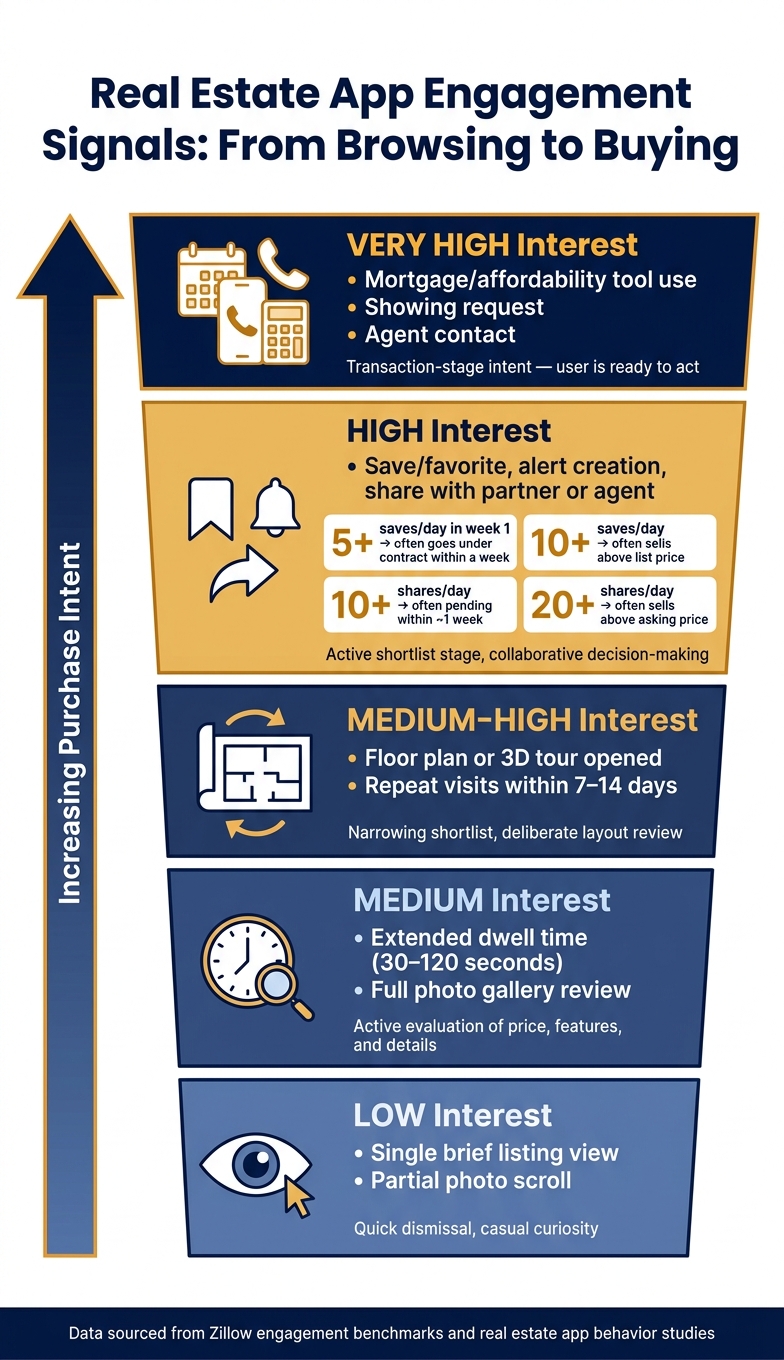
Real Estate App Engagement Signals: From Browsing to Buying
Once users narrow their search filters, the next clue is how they behave on individual listings. This is where listing engagement starts to matter. Dwell time, repeat visits, saves, and contact actions help show how close someone is to making a choice.
Views, Dwell Time, and Repeat Visits
Time on page says a lot. Under 5 seconds is usually casual. A visit that lasts 5–30 seconds often looks like a fast scan. Around 30–120 seconds points to active review. And when someone stays for more than 2 minutes, they’re often digging into floor plans, virtual tours, or neighborhood details.
Repeat visits make that signal much stronger. If the same user comes back to the same listing across multiple sessions – especially within a 7–14 day window – that pattern points to active consideration far more than one long visit does. Listings that get about 250+ views per day in their first week are much more likely to go pending within a week. But if views are high and saves stay low, those homes often sit on the market longer.
It’s not just about time, either. Users who scroll through most or all photos, zoom into certain images, open floor plans, or start 3D tours are showing more deliberate review behavior. Teams often track signals like photo completion rate, floor-plan open rate, map view rate, and 3D-tour start rate to tell the difference between someone who is checking whether a home fits their life and someone who left after the hero image.
From there, repeat visits help show whether that interest sticks.
Saves, Shares, Alerts, and Contact Actions
After filters narrow the field, saves and shares usually mean more than views. Why? Because they show active comparison and, in many cases, collaboration. Zillow’s data shows that listings averaging 5+ saves per day in the first week often go under contract in about a week. At 10+ saves per day, homes often sell above list price. And when average daily saves go past 50, some properties move to pending in only a few days.
Shares send a similar message. Listings shared 10+ times per day often reach pending status within about a week. At 20+ shares per day, homes often sell above asking price. Shares happen less often than saves, but they can say a lot. In plain English, it often means the buyer is looping in a partner, family member, or agent.
The strongest actions are alerts, showing requests, agent contact, and use of mortgage or affordability tools. Users who sign up for alerts on price changes or similar new listings are showing steady interest in a specific area. And when financing-tool use shows up alongside high dwell time, multiple photo views, saves, and alerts in a short period, product teams often label that mix as very high intent.
Once a user saves, shares, or reaches out, they’ve moved past casual review and into action.
Engagement Actions by Interest Level: Comparison Table
| Action Type | Typical Observed Pattern | Likely Interest Level |
|---|---|---|
| Single brief listing view | Quick dismissal, little or no interaction | Low – casual curiosity |
| Photo gallery scroll, partial | Reviews a few photos, then exits | Low to medium – initial screening |
| Extended dwell time | Reviews photos, key features, and price details | Medium – substantive evaluation |
| Floor plan or 3D tour opened | Deliberate review of layout and livability | Medium-high – active consideration |
| Repeat visits | Returns multiple times over several days | Medium-high – narrowing shortlist |
| Save or favorite | Bookmarks listing for future reference or comparison | High – strong resonance |
| Save similar homes or build a collection | Actively building a shortlist in a specific area | High – active shortlist stage |
| Alert creation | Opts in to ongoing updates for a property or area | High – sustained active interest |
| Share with another person | Sends listing to a partner, family member, or agent | High – collaborative decision-making |
| Mortgage calculator or affordability tool use | Assesses whether the property is financially feasible | High – readiness evaluation |
| Showing request or agent contact | Submits inquiry or schedules a tour directly in-app | Very high – transaction-stage intent |
These signals can shift by user segment and by market, which is why clean tracking makes such a big difference.
Feature Usage by Market, User Segment, and Data Infrastructure
Map Search, Alerts, and Conversational Search by User Group
The same search and engagement signals shift based on who’s searching and how clean the property data is.
Feature use changes by user group and market. Buyers in high-cost markets tend to use tight polygons and frequent alerts to narrow options fast in competitive inventory. Renters lean on broad map views plus alerts so they can spot availability before it disappears. Investors, by contrast, scan multiple ZIP codes with filters for price, property type, and days on market because they’re screening for yield, not livability.
Market conditions shape this behavior too. In lower-cost markets across the Midwest and South, people tend to use broader location filters and simpler criteria. In high-cost markets, users rely more on tight spatial tools and narrow saved searches.
There’s also a clear split by experience level. Newer buyers and younger renters are more likely to use natural-language search. Experienced investors still tend to stick with structured filters.
That split shows up clearly across four user groups:
| Segment | Primary Features Used | Core Intent |
|---|---|---|
| Buyers (high-cost markets) | Polygon drawing, tight saved searches, school overlays, frequent alerts | Narrow fast, act quickly in competitive inventory |
| Buyers (lower-cost markets) | Broad map search, basic filters, saved searches | Explore inventory, refine gradually |
| Renters | Map search, fast filters, high-frequency alerts | Capture availability before it disappears |
| Investors | Multi-market scanning, valuation layers, rental-market data, polygon tools | Screen for yield, not livability |
Why Clean Property Data Matters for Behavior Analytics
These patterns only hold up when listings, locations, and contact records are accurate.
If a listing is misclassified – for example, a condo marked as a single-family home – then every filter action tied to that listing can distort what users seem to want. The same goes for geospatial data. If parcel boundaries or school district overlays are off, it’s hard to tell what users mean when they draw polygons or apply school-rating filters.
Listing status and ownership records also need to stay current. If alerts keep firing on stale listings or homes that are already pending, engagement metrics can look stronger than they are, and users start losing trust. Contact data has the same issue. A tap-to-call or inquiry only works as a conversion signal when it points to a real, reachable person.
This is where infrastructure like BatchData comes into play for behavior analytics. BatchData supports this work with property and contact data enrichment, property search APIs, phone verification, bulk data delivery, and professional services for integration and analytics.
Conclusion: Key Signals from Real Estate App Behavior
Across the study, search behavior points to demand only when it’s read in context. Search filters act as early demand signals. Price ceilings, bedroom counts, and school-zone inputs show intent before users ever engage with a listing. Feature use also shifts in clear ways by user type and market. And none of that search behavior is useful unless the data behind it is accurate, current, and tied to the right segment.
FAQs
How early can app search behavior predict housing demand?
App search behavior can work like an early warning sign for the housing market. It gives investors and analysts a way to spot shifts months before they show up in public data. Search trends and online valuation requests, for example, can hint at what people are planning before those plans are out in the open.
Pair those signals with property data, and the picture gets much sharper. In some cases, they can forecast more than 70% of new home listings within a year. And some actions matter more than others. A person making a specific valuation request is often much closer to selling than someone just browsing, which means these high-intent signals can point to market readiness faster than older metrics.
Which user actions signal serious buying or renting intent?
Serious intent to buy or rent usually shows up in actions that go past casual browsing. For example, requesting an online home valuation can point to near-term plans to sell or make a move. And attending open houses is one of the clearest signs that someone is ready to act.
Some platforms also pair these high-intent behaviors with predictive analytics to tell motivated users apart from casual observers.
How does bad listing data affect behavior analysis?
Bad listing data makes behavior analysis less accurate. It hides true intent and adds friction where teams need clarity most.
The result? Lead scoring can drift off course. Teams may miss motivated sellers while spending time on people who were never likely to move forward.
Outdated, incomplete, or inconsistent data makes things worse. It becomes much harder to spot the signals that matter, like financial readiness or search patterns. And when there’s no cross-checking or data enrichment, the analysis starts lumping users into groups that are too broad.
That broad-brush view hurts conversion rates. It also makes actual market demand harder to see, which can leave teams reacting to noise instead of what buyers and sellers are telling them.