






































Neighborhood analysis fails when teams trust citywide averages, because the deal is rarely lost at the city level. It's lost on the block, the tract, the buffer, or the boundary you never tested, where market conditions and risk signals stop behaving like the rest of the metro. The fix is a small-area workflow that combines the right geography, clean data, and repeatable scoring, so underwriting, portfolio review, and marketing all use the same local truth.
Modern practice is built on tract-scale and ZIP-scale comparison, not anecdote. The National Neighborhood Data Archive gives neighborhood socioeconomic measures for U.S. census tracts from 1990–2022 and ZIP Code Tabulation Areas from 2008–2022, which is exactly the kind of longitudinal base you need when you're separating noise from durable local change (ICPSR publication record). That shift matters because a good neighborhood read is no longer a description, it's a decision system.
- Start with the right boundary. If the unit is wrong, the score is wrong.
- Use multiple indicators. Housing, demographic, and market signals all matter.
- Test stability. A score that changes with a tiny geography tweak isn't ready.
- Map the result. If you can't see it, you'll miss the edge cases.
The rest of the process is about turning that local view into something defensible, repeatable, and useful to people who need to act on it fast.
Why Does Neighborhood Analysis Matter
A deal can look solid at the city level and still fail in one narrow pocket. That's where risk starts building, or where demand is concentrated in a way broad averages hide. Neighborhood analysis gives lenders, marketers, and portfolio teams a local read based on tract-level, block-group-level, or buffer-based evidence instead of vague impressions.
The shift from broad observation to small-area analysis
City and county averages smooth out variation that matters in practice. Small-area analysis shows where conditions differ, which is the only way to separate a real neighborhood signal from a metro-wide summary that hides it. The Census and related guidance support tract, block-group, and ZIP-code work, and that same logic supports the National Neighborhood Data Archive's tract-level socioeconomic and demographic measures from 1990–2022 and ZIP Code Tabulation Area measures from 2008–2022 (ICPSR publication record).
That time span gives analysts a usable frame for comparing population density, race and ethnicity, age, income, poverty, public assistance, and family structure across local geographies over time. The point is not to collect more fields for the sake of volume. The point is to build a local decision layer that shows which areas are stable, which are changing, and which are being misread by broad-market averages.
Practical rule: If two neighborhoods look the same at the city level, treat them as different until tract-level evidence shows otherwise.
That is the practical value. Neighborhood analysis lets teams compare local conditions, document the basis for decisions, and replace stories that sound plausible with evidence that can survive spatial scrutiny.
What Are the Objectives of Your Neighborhood Analysis
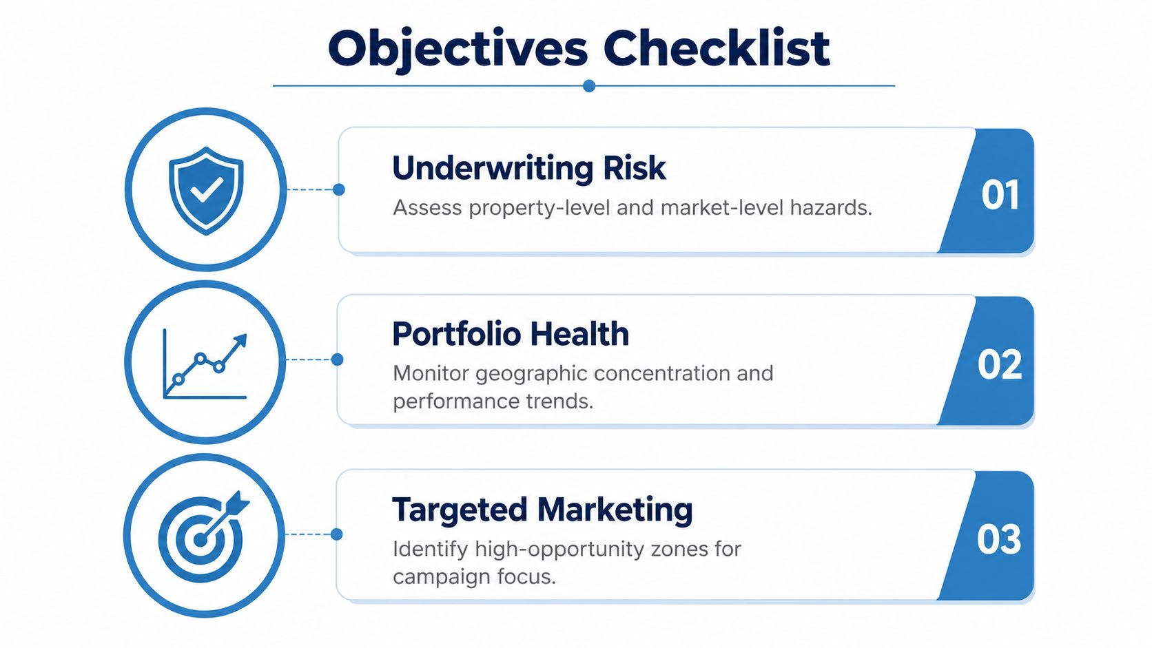
A useful neighborhood analysis starts with a decision, not a map. If you don't define the business question first, you end up collecting every indicator available and none of them line up with the action you need to take. The objectives should tell you whether you're trying to reduce underwriting uncertainty, monitor geographic exposure, or improve campaign targeting.
Match the objective to the business decision
For underwriting, the objective is usually to understand whether neighborhood conditions support property value, marketability, and risk acceptance. For portfolio health, the objective is to spot concentration, drift, or weakening submarkets before performance slips. For targeted marketing, the objective is to identify areas where outreach is likely to be relevant, timely, and worth the cost.
A clean way to define this is to write three lines for every project:
- Decision owner. Who will use the result.
- Decision type. Approve, monitor, prioritize, or route.
- Tolerance for error. A lending model needs tighter defensibility than a campaign map.
The geographic unit has to match that decision. A 2024 neighborhood-profile study showed that a single city can contain multiple distinct neighborhood patterns, which is why sensitivity testing across tracts, blocks, and buffers is essential before you treat any boundary as real (KU small-area analysis guidance). If the objective is parcel-level underwriting, a ZIP code may be too coarse. If the objective is citywide opportunity screening, a custom buffer might be enough.
Document success criteria before you touch the data
Don't wait until the end to define what “good” looks like. A strong objective template includes the main metric, the fallback metric, and the review step if the result is ambiguous. That keeps you from changing the objective midstream when the first answer is inconvenient.
A simple objective matrix works well:
| Use case | Primary objective | What success looks like |
|---|---|---|
| Underwriting risk | Separate stronger and weaker local markets | The score supports a yes, no, or review decision |
| Portfolio health | Track local concentration and trend drift | The dashboard flags submarkets before performance degrades |
| Targeted marketing | Focus outreach on high-opportunity zones | The list is narrow enough to be actionable |
Define the decision first, then choose the geography, then choose the indicators. Reversing that order is how projects become expensive and inconclusive.
What Data Sources and Quality Checks Matter
You need sources that are current, documented, and aligned to the geography you're analyzing. Raw feeds aren't enough. If the record structure is messy or the vintage is stale, a neighborhood model will still produce a score, but it'll be a score built on hidden drift, duplicates, or incompatible measurement scales.
| Source | Attributes | Frequency | Quality Checks |
|---|---|---|---|
| Property records | Ownership, parcel traits, valuation fields, address structure | Daily or near-daily in production workflows | Address normalization, duplicate detection, missing critical fields |
| MLS data | Listings, status changes, days on market, comp activity | Frequent market updates | Outlier detection, stale listing checks, closed-sale validation |
| Permits | New construction, renovations, additions, activity timing | Ongoing municipal updates | Jurisdiction matching, date completeness, permit type consistency |
| Census data | Demographic and socioeconomic context at tract or block-group scale | Periodic release cycles | Geography alignment, vintage checks, tract boundary consistency |
| Risk-signal feeds | Foreclosure, distress, or market-friction indicators | Varies by source | Event timing validation, false-positive review, threshold testing |
The value of this mix is that each source covers a different layer of the neighborhood story. Census context tells you who lives there and how the area is changing. Property and MLS data tell you how the market is behaving. Permits and risk signals show whether the direction of travel is strengthening or deteriorating.
For a broader sourcing strategy, the complete guide to real estate data sources for 2026 is a useful reference point when you're deciding what to pull, merge, or leave out. The key move is not collecting everything. It's keeping the feed list tight enough that each source earns its place in the model.
Quality control that actually prevents bad outputs
Start with completeness, timestamp alignment, and geography match. If one source is updated daily and another lags by months, the composite can create false confidence. If a permit feed is accurate but doesn't join cleanly to the neighborhood boundary, it's still unusable.
A few controls pay off fast:
- Check missingness early. Missing key fields should block the run, not be patched after scoring.
- Review outliers before aggregation. One bad comp can distort a neighborhood average.
- Standardize geography names. “Tract 101.02” and “101.2” should never live as separate units.
- Track refresh cycles. A score is only as current as its oldest input.
BatchData fits naturally into this workflow when you need property, ownership, permit, and market signals in one developer-facing system, but the core advantage is process discipline, not the tool itself. If your inputs are inconsistent, every downstream score inherits that inconsistency.
How to Model and Score Neighborhoods
A defensible neighborhood score starts with spatial aggregation, not guesswork. The workflow is direct, but the boundary choice, the kernel, and the standardization step all change the result. Skip those decisions, and you can end up with rankings that look precise while behaving in unstable ways.
Use a repeatable spatial aggregation pipeline
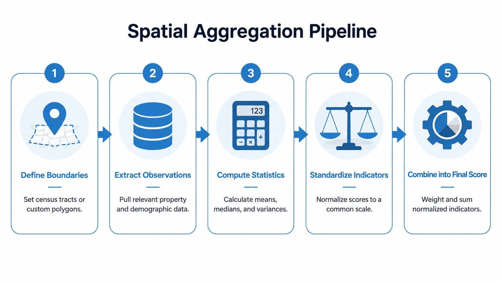
Start by defining the neighborhood boundary, then identify the observations inside it, compute the statistic, and assign that statistic back to the focal location. Repeat the same process across every location with a moving window or roving neighborhood so the output reflects local context rather than one fixed point (Innovative GIS topic on map analysis).
That moving-window setup is what makes the method useful in practice. It lets you compare local areas consistently while preserving the spatial relationship between the focal property and the surrounding market. It also gives you a clean structure for building a composite index when no single variable captures the neighborhood on its own.
A practical sequence looks like this:
- Define the boundary. Use a tract, block group, buffer, or custom polygon.
- Pull the observations. Include every property, comp, or demographic record inside it.
- Calculate local summaries. Use means, medians, variance, or distance-weighted values.
- Normalize the inputs. Put heterogeneous indicators on the same scale.
- Combine into a score. Weight the normalized indicators and test the result.
Test multiple radii before you trust the score
Boundary sensitivity is where strong models separate from pretty maps. Results can move materially when you change the window size, the shape, or the edge rule, so practitioners should test multiple radii or kernels before operationalizing an index (Innovative GIS topic on map analysis). That is the difference between a stable local signal and a score that changes because you nudged the polygon.
Working rule: If a score only works at one radius, it is not a score yet. It is a tuning artifact.
Standardize before combining indicators
In real estate work, raw variables rarely share a scale. Density, land use mix, vacancy, income, and distress signals cannot be summed responsibly unless they are standardized first. The best practice is to convert each indicator onto a common scale before combining them into a composite index, especially when you are mixing demographic and market variables (Innovative GIS topic on map analysis).
A common failure mode is over-weighting the variables that happen to have the largest numeric range. Another is combining reliable and unreliable signals without checking whether they measure the same spatial support. Both create spurious rankings that feel analytical but do not hold up under review.
Quality control that prevents bad outputs
Production work needs a control layer before the score ever reaches underwriting or marketing. That means checking joins, boundary assignments, and refresh cycles before the model is treated as a decision input. I also recommend tying the scoring workflow to a lead-scoring framework, which is the same reason teams use the BatchData guide on how to build a real estate lead scoring system with property data APIs, because the model has to be explainable enough for non-technical users to trust it.
If you are wiring this into BatchData, keep the method transparent. Use the platform to organize property, ownership, permit, and market signals in one workflow, but keep the scoring logic visible enough that underwriting and marketing teams can audit the inputs, compare runs, and see why a neighborhood moved up or down.
How to Visualize and Map Neighborhood Data
A map should show where the score changes, not decorate the report. The point of visualization is to reveal spatial concentration, edge effects, and local variation fast enough for a reviewer to see what the model may have missed. In neighborhood work, a good map usually beats a long spreadsheet because it makes boundary problems visible.
A practical test is simple. If the map does not help someone answer where the score shifts, what boundary is driving it, and whether nearby areas behave differently, the visual is not doing its job.
Pick the map type that matches the question
Use a choropleth when you want to show density or rate differences across defined geographies. Use a heatmap when you want to show concentration around comps, activity, or points of interest. Use a time-series chart when the core question is trend, drift, or seasonality rather than location.
The wrong visualization leads to the wrong read. A vivid color scale on a noisy indicator can make a weak pattern look important. A cluttered legend can hide the exact boundary where the score flips. A map without scale context can make a local pocket look broader than it is.
A solid mapping workflow usually follows this order:
- Choose the geography first. Tracts, block groups, buffers, or parcels.
- Match the geometry to the metric. Rates and densities need different treatment than counts.
- Use restrained color logic. Single-hue ramps work well when higher and lower values are the story.
- Label selectively. Too many labels hide the pattern you are trying to show.
For GIS layers, geometry handling, and field alignment, the BatchData GIS layer documentation is a practical reference point, especially when you are preparing neighborhood fields for maps, dashboards, or export pipelines: GIS data layers.
Build maps that different teams can read
Underwriters want neighborhood context, boundary consistency, and the specific property's position in the local market. Marketing teams want to see where to focus spend and where not to. Portfolio teams want to compare one submarket against another without digging through a separate file for every view.
That usually means the same neighborhood score needs three visual treatments.
| Audience | Best view | What they need to read quickly |
|---|---|---|
| Underwriting | Boundary map with overlays | Risk context around the subject property |
| Portfolio | Comparative submarket map | Which areas are weakening or diverging |
| Marketing | Opportunity heatmap | Where outreach is likely to be relevant |
Keep the map readable for the people who use it. If the question is underwriting risk, show the subject property and the relevant boundary sensitivity, not every available layer. If the question is marketing allocation, use a cleaner view that highlights where response is likely to justify spend.
A useful next step is to test the same neighborhood score at multiple boundary scales before handing it off. A tract view, a block-group view, and a custom buffer can tell different stories, and that matters when underwriting wants defensible context while marketing wants a clear action area. BatchData teams often pair that workflow with a simple template for analysts, then reuse the same output structure across reports so the map is consistent even when the audience changes.
A map can also surface whether the score is stable or fragile. If a neighborhood looks strong at one scale and weak at another, the issue may be the boundary choice rather than the market itself. That is exactly the kind of disagreement you want to catch before the visual reaches a decision maker.
The best map answer is usually the simplest one that still preserves local context.
What Are Common Pitfalls and How to Avoid Them
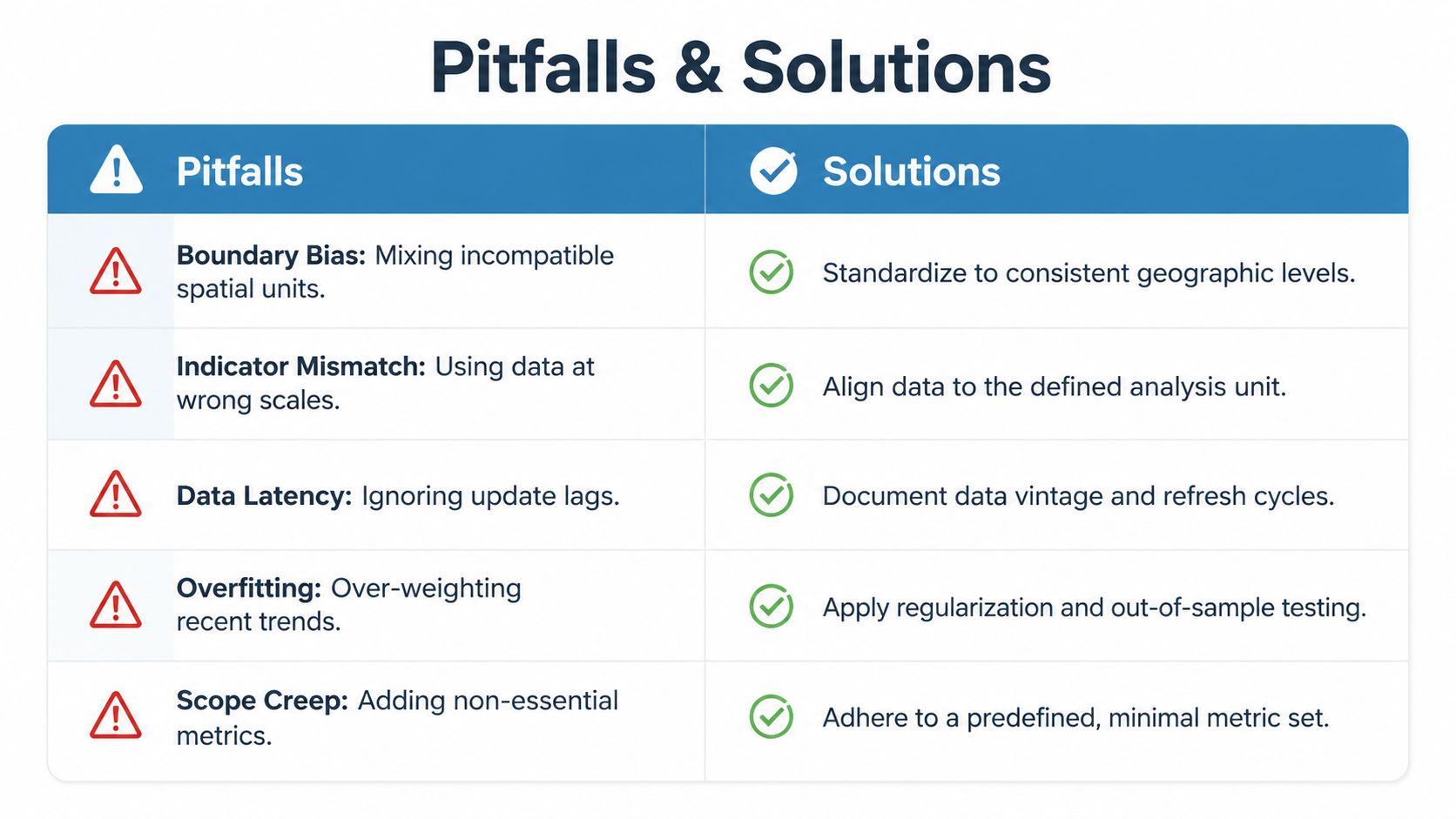
Most neighborhood analysis failures come from avoidable methodological mistakes, not bad intent. The score breaks when the geography is inconsistent, the indicators are misaligned, or the refresh lag is ignored. Those errors are common because each one still produces a number, and that number can look credible at a glance.
Fix the five mistakes that distort local scores
| Pitfall | What goes wrong | Fix |
|---|---|---|
| Boundary bias | Mixing tracts, blocks, ZIPs, or custom buffers without discipline | Standardize to one geographic level per analysis |
| Indicator mismatch | Using a metric at a scale it wasn't designed for | Align every input to the chosen boundary |
| Data latency | Treating stale feeds like current market conditions | Document vintage and refresh cycles |
| Overfitting | Letting a single recent trend dominate the score | Use out-of-sample checks and restraint in weighting |
| Scope creep | Adding metrics that don't improve the decision | Keep the metric set minimal and predefined |
The hardest of these to spot is scope creep. Analysts keep adding “one more” variable because it feels safer, but every extra input increases the chance of contradiction. A compact model is easier to validate, explain, and maintain.
Check for reliability before you operationalize
A score should survive three questions before anyone uses it in production. Does it hold when you change the boundary slightly. Does it still make sense when one source is refreshed. Does it align with how the market team or underwriting team makes decisions.
If the answer to any of those is no, the model needs revision, not more decoration. That's especially true when different spatial supports are mixed in the same file, because the output can look precise while reflecting incompatible measurement units. A disciplined workflow keeps those issues visible instead of hiding them inside a tidy rank order.
How to Use Neighborhood Analysis in Real Estate Scenarios
The same local framework can power underwriting, portfolio monitoring, and marketing, but each use case needs a different output. A common mistake is trying to make one neighborhood score do everything. A better approach is to keep the core spatial logic stable and change the decision layer on top of it.
For underwriting, the output should be a subject-property view that combines neighborhood boundaries, local characteristics, and market data from sources such as MLS, public records, and price indices, which is exactly the kind of objective neighborhood analysis required in Fannie Mae appraisal guidance (Fannie Mae neighborhood section guidance). That means the model needs to be explainable to an appraiser, a loan officer, or a credit reviewer without extra interpretation.
For portfolio monitoring, the dashboard should compare neighborhoods over time so teams can spot weakening areas before concentration becomes a problem. Neighborhood indicator systems are useful because they combine housing costs, vacant buildings, foreclosure rates, permits, subsidized housing, demographics, and flood zones into one view of local change (Urban Institute indicator systems guide). If a location starts drifting, the trend matters more than the single snapshot.
For targeted marketing, the model should surface areas where the local profile supports outreach, then hand the list to the team that runs campaigns. If you need a concrete example of how local context changes market interpretation, the NYC furnished apartment market analysis from RentReboot is a useful read because it shows how a neighborhood-level lens changes the way demand and positioning are read in a specific submarket.
The practical workflow is straightforward:
- Underwriting. Pull subject property data, run the boundary score, and attach the neighborhood summary to the file.
- Portfolio. Refresh the same score on a schedule and flag movement by tract or submarket.
- Marketing. Use the neighborhood output as a targeting layer, then pass it to list building or routing logic.
If you want the spatial layer, property layer, and operational workflow in one place, BatchData can provide the data plumbing behind that setup, but the value comes from keeping the decision rules tight and the boundary choices explicit.
BatchData gives teams the property records, ownership data, valuation signals, and spatial context needed to run neighborhood analysis without stitching together brittle one-off sources. If you're building underwriting logic, portfolio monitoring, or targeted outreach around local market conditions, visit BatchData and see how its data workflows can support a cleaner neighborhood-level process.