


































If I had to judge an AVM fast, I’d look at just 4 things: how close it is, whether it runs high or low, what the miss means in dollars, and how often I can trust the result.
That means checking:
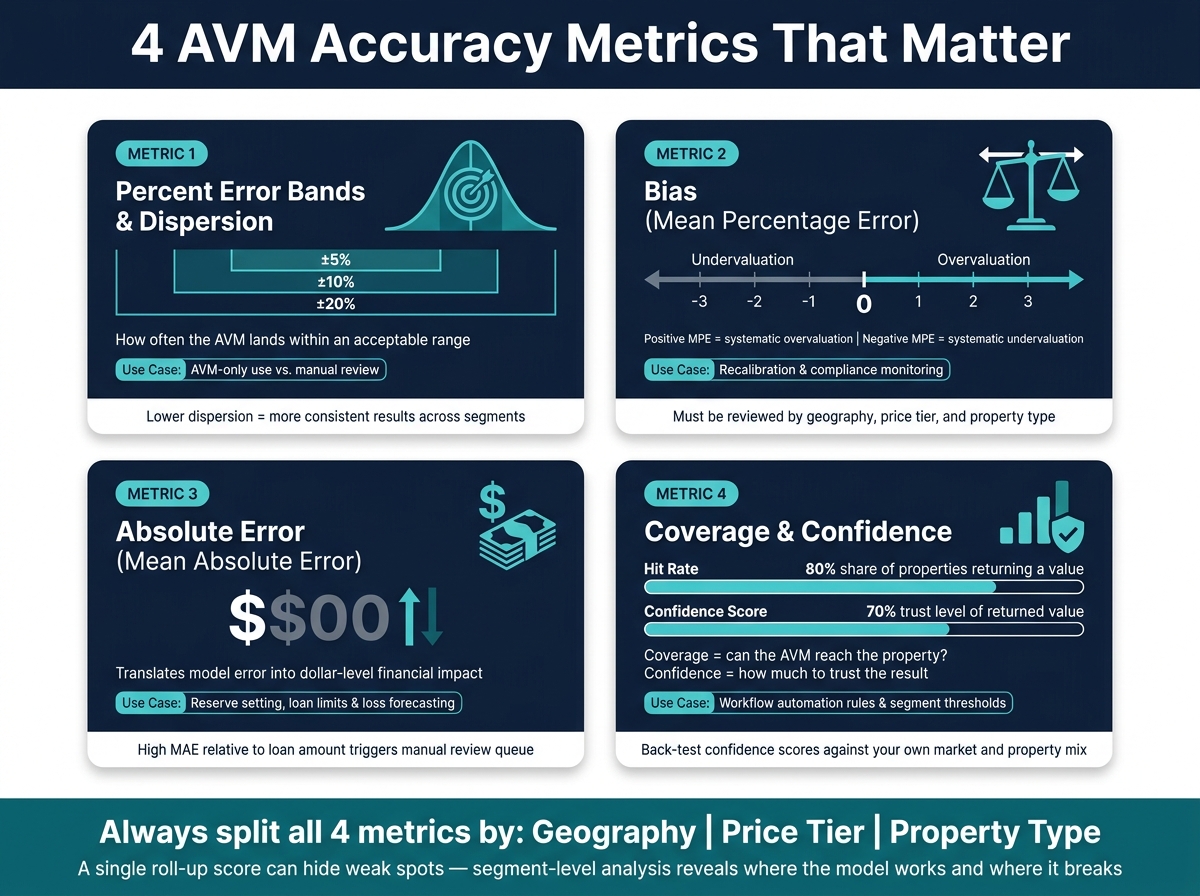
- Percent error bands and dispersion: how often the AVM lands within ±5%, ±10%, or ±20%
- Bias (MPE): whether values skew too high or too low
- Absolute error (MAE): what the miss looks like in $
- Coverage and confidence: how often the model returns a value, and where that value is safe to use
Here’s the short version: a model can look good on averages and still miss badly in condos, rural areas, or low-sales markets. That’s why I’d never judge an AVM by one score alone. You need all four metrics, split by geography, price tier, and property type, to see where the model works and where it starts to break.
4 AVM Accuracy Metrics: What They Measure & When to Use Them
Smarter valuation insight, earlier in the lending process
sbb-itb-8058745
Quick Comparison
| Metric | What I learn from it | What it helps me decide |
|---|---|---|
| Percent Error Bands / Dispersion | How tight or spread out errors are | AVM-only use vs. manual review |
| Bias (MPE) | If the model trends high or low | Recalibration and control checks |
| Absolute Error (MAE) | Dollar size of misses | Loan limits, reserves, and loss estimates |
| Coverage / Confidence | How often I get a usable value | Workflow rules and trust by segment |
Bottom line: if you want a clean read on AVM accuracy, these four checks are the shortest list that still gives you the full picture.
Metric 1: Percent Error Bands and Dispersion
What percent error bands tell you
A percent error band answers one simple question: how often does the AVM land within an acceptable range? Studies often report the share of valuations that fall within ±5%, ±10%, and ±20% of the benchmark. Smaller bands make the test tougher. The right cutoff depends on how the valuation will be used.
How dispersion adds context to averages
Average error can hide a big spread. That’s where dispersion metrics help. Standard deviation, interquartile range, and coefficient of dispersion (COD) show whether errors stay packed close together or bounce around across segments.
Lower dispersion means the AVM is more consistent. Higher dispersion points to more variation by market, price tier, or property type.
How teams apply these results in policy
Percent bands and dispersion scores map straight to operating rules. Teams can set thresholds for AVM-only use and send high-dispersion segments to manual review, especially when coverage changes by market or property type.
Breaking results out by market, price tier, and property type also reveals weak spots that a single roll-up score can miss. That same split makes the next metrics easier to read too: bias, absolute error, and coverage often look very different from one segment to another.
Metrics 2 and 3: Bias and Absolute Error
Bias: What mean percentage error reveals
Once you understand spread, the next step is simple: is the model missing high, low, or in a way that costs money?
Mean percentage error (MPE) shows directional bias. A positive MPE points to systematic overvaluation. A negative MPE points to systematic undervaluation. That kind of bias matters because it can affect fair lending compliance, loss forecasting, and underwriting controls.
MPE also needs to be read by segment. If you only look at the full portfolio, positive and negative errors can cancel each other out and hide the pattern. That’s why teams should review results by geography, price tier, and property type to catch drift before it shows up in underwriting or compliance reviews.
Absolute error: Connecting model accuracy to dollar impact
If MPE tells you the direction, mean absolute error (MAE) tells you the dollar size.
That makes MAE useful when a team needs to understand the possible dollar misstatement per loan or asset. It’s especially helpful for reserve setting and loss forecasting.
Put another way, MPE shows whether the model leans high or low. MAE shows how much those misses add up to in dollars. Used together, they give teams a clear picture of both the pattern and the cost of model error.
How bias and error results should change operations
In practice, bias and error results should shape recalibration, review queues, and approval limits.
- Segments with repeated directional bias should be first in line for recalibration.
- Segments with high MAE relative to the loan amount should get a lower approval limit or move into an automatic manual review queue.
When teams can trace drift at the segment level, they can set a targeted threshold instead of applying one portfolio-wide correction.
And even if a model shows low bias, that doesn’t mean it’s ready for broad use. It still needs coverage and confidence checks first.
Metric 4: Coverage, Hit Rate, and Confidence Scores
Coverage and hit rate define how far an AVM can reach
Coverage is the share of submitted properties that return a value. Hit rate is the return rate in production. That difference matters more than it may seem at first glance. An AVM can post strong error numbers on the cases it chooses to value and still fail in practice if it skips too many properties. Low coverage breaks automation even when the scorecard looks good.
A single top-line hit rate can also hide trouble. If results are selective, the model may look strong only because it performs well on easier properties. That’s why teams should compare coverage by segment and geography instead of leaning on one overall number. If your portfolio spans different property types or markets, a high hit rate on standard suburban homes doesn’t say much about the places where you actually need the model to work.
Matching rules shape this tradeoff in plain terms. Tight controls, like limiting results to one subdivision or using a narrow bedroom and bathroom range, often lower observed error and push confidence higher. But they usually cut hit rate too. Loosen those rules by expanding the search radius or relaxing property filters, and coverage goes up. The catch is that the AVM may pull in less relevant sales, which can widen both error and confidence bands.
Coverage tells you whether the AVM can reach the property. Confidence tells you how much faith to put in the value it gives back.
How confidence scores separate usable values from risky ones
Many modern AVMs return more than a point estimate. They may also give bounds or a confidence score. That extra layer is useful, but only if you test it. Confidence scores should be back-tested against your own market mix and property mix, not taken at face value.
A score ranking that works in one geography or one property segment may fall apart in another. That’s why confidence needs validation, not guesswork. Portfolio averages can blur the picture here too. A decent average score may still hide weak spots in certain segments.
Turning confidence scores into workflow rules
The confidence result should drive decisions, not just sit in a report.
| Matching Control | Hit Rate Impact | Error / Confidence Impact |
|---|---|---|
| Tight radius / subdivision | Lower – fewer properties qualify | Lower error; matches are highly localized |
| Exact characteristic match | Lower – harder to find identical comps | Higher confidence; evidence closely aligned |
| Broad radius / custom boundaries | Higher – larger pool of potential sales | Higher error; may cross neighborhood lines |
| Relative ranges (+/- 10–20%) | Balanced – adapts across property types | Stable; consistent evidence set across markets |
A practical setup is simple:
- Set a minimum confidence threshold for automated decisions, and send anything below that line to manual review.
- Use relative rule sets, such as “one bedroom either side of the subject,” so one setup can work across different property archetypes.
- Track coverage and confidence every month to spot drift in data feeds or shifts in market conditions.
That turns confidence from a passive number into a working control for day-to-day valuation flow.
Putting All 4 Metrics to Work: Selection, Monitoring, and Reporting
A simple scorecard for comparing AVM candidates
When you compare AVM candidates, keep the setup the same across the board: same test set, same time period, and same property segments. Then look at all four metrics next to each other.
| Metric | What It Shows | Primary Use Case |
|---|---|---|
| Percent Error Bands | Closeness and accuracy | Model selection & policy setting |
| Bias (MPE) | Direction of error (over/under) | Ongoing monitoring & policy setting |
| Absolute Error (MAE) | Dollar-level financial impact | Executive reporting & risk management |
| Coverage & Confidence | Reach and practical usability | Model selection & workflow rules |
One thing can throw off the whole comparison: messy input data. If square footage, land-use codes, or other property fields aren’t standardized, you’re not just testing the model. You’re also testing data inconsistency. That muddies the picture fast.
Normalized property data helps cut that noise. It keeps segment differences tied to model performance, not mismatched records.
What to track every month or quarter
After you set the scorecard, use that same format for monthly or quarterly reporting. That way, you’re not changing the yardstick every time you check results.
Track:
- share within ±10%
- dispersion
- MPE
- MAE
- coverage/hit rate
- confidence-score distribution
Then break every metric out by geography, price band, and property type. That’s how you spot local drift when market conditions start moving around.
Conclusion: The Shortest List of AVM Metrics That Still Gives a Full Picture
These four metrics cover the full picture. Percent error bands show how close the model gets. Bias shows whether it tends to run high or low. Absolute error turns model performance into dollar impact, which is the language risk committees and executives actually use. Coverage and confidence show how far the model can go in day-to-day use and which outputs are safe to act on without manual review.
Put together, they give you a practical way to choose models, watch performance over time, and report results in plain terms.
FAQs
Which AVM metric matters most?
For evaluating automated valuation models, control matters most.
BatchData puts a spotlight on something simple but important: if you want valuations you can defend, you need tight control over how properties are matched. That means setting clear limits around things like distance from the subject property, geographic boundaries, and property details such as bedroom count, living area, and year built.
Those range-based controls help keep valuations consistent and reliable across different property types and markets. They also reduce drift, which can quietly push results off course over time.
How often should AVM accuracy be reviewed?
AVM accuracy should be reviewed on a consistent schedule so models stay defensible as upstream data shifts.
Because valuation work is often repetitive, teams should watch performance on a steady basis instead of relying on occasional checks. Regular reviews help confirm match settings, output quality, and compliance when models support mortgage originations or credit decisions.
Why can a strong average AVM score be misleading?
A strong average AVM score can sound good on paper. But it can also hide how the estimate was produced. And that creates a problem fast: when sellers, clients, or investment committees push back, users may struggle to explain or defend the number.
A lot of these models work like black boxes. They spit out a single figure without showing the data, logic, or assumptions behind it.
BatchData takes a different path. It gives users transparent, rule-based data so they can decide what should count as comparable.