






































SEO Title: NJ Real Estate Report Guide to Data and Metrics
Meta Description: Learn how to build and interpret an NJ real estate report using the right metrics, data sources, and reporting workflows.
Meta Keywords: NJ real estate report, New Jersey housing market, real estate data, market report metrics, property data platform, lending risk analysis, investor market analysis
New Jersey housing looks simple in headlines and complicated in practice. The statewide median sales price reached $525,000, up 3.4%, while homes took 43 days to sell, a 4.65% year-over-year increase, according to the NJ REALTORS® May 2026 Housing Market Data Report. That combination matters more than either number alone because it signals a market where price support remains intact even as transaction speed slows.
Most market summaries stop there. A professional NJ real estate report doesn't. It separates lagging indicators from leading indicators, tracks where the market is merely stable versus where it's repricing, and turns raw feeds into operational decisions for investors, lenders, insurers, and proptech teams.
Core takeaways
- Headline prices are not enough. You need inventory, velocity, segmentation, and sourcing context to understand risk.
- Median and average values answer different questions. They should never be treated as interchangeable.
- Static monthly PDFs are backward-looking. A modern report should update dynamically and support alerts, dashboards, and API delivery.
- Professional users need different reads of the same market. An investor, underwriter, and product team should not consume the same output in the same format.
A useful benchmark for local market context is county-level data such as our Investor Pulse reports, which include Bergen County.
The State of the New Jersey Real Estate Market
Permits and listings often turn before median price does. That matters in New Jersey, where statewide averages can stay firm even as county-level activity starts to weaken, stall, or split by product type.
Current conditions are better described as an uneven repricing process than a simple cooldown. Price metrics remain useful, but they are lagging indicators. By the time the statewide median confirms a shift, acquisition teams and credit committees are already late. A professional market read separates what has happened from what is starting to happen.
The operational question is straightforward. Which signals belong in a backward-looking summary, and which belong in a forward-looking report that can change underwriting, outreach, and hold-period assumptions this month?
What a statewide snapshot does and does not tell you
Statewide price and time-to-sale figures help frame the market. They do not explain where risk is building.
An investor buying small multifamily in North Jersey, a lender reviewing suburban retail collateral, and a builder tracking new supply in fast-growing corridors are not exposed to the same cycle. Their reports should not rely on the same lead indicators either. Median sale price can confirm that values held. It cannot show whether permit issuance is slowing, whether new listings are outpacing pendings, or whether price cuts are clustering in one band before they spread.
That is why serious operators split market evidence into two groups:
- Lagging indicators: median sale price, closed volume, average sale-to-list ratio, recorded appreciation
- Leading indicators: building permits, new listings, pendings, withdrawal rates, price reductions, financing mix, and inventory growth by segment
The distinction changes decisions. If median price is flat to positive while permits fall and listings accumulate, the report should flag supply restraint and buyer hesitation at the same time. If permits rise, pendings recover, and concessions narrow before the median moves, the market may be stabilizing earlier than closed-sale data suggests.
What current conditions imply for investors and lenders
Three practical conclusions follow.
- New Jersey should be modeled as a set of micro-markets. County, ZIP code, asset class, and price band matter more than the statewide headline in periods of transition.
- Lagging strength can hide early deterioration. A stable median can coexist with slower absorption, more negotiation, and weaker demand for lower-quality inventory.
- Static monthly summaries are too slow for active operators. A useful NJ real estate report should refresh automatically as source datasets update, then trigger review when thresholds break.
County-level reporting offers greater value than a generic statewide recap. A localized benchmark such as the county-level data in our Investor Pulse reports shows how segmentation, inventory behavior, and investor activity create a different read than the top-line New Jersey average.
For investors, that changes bid discipline and disposition timing. For lenders, it changes surveillance, collateral review, and the assumptions used in stress testing. The market has not moved in one direction. It has separated into pockets that need to be measured differently.
What Is an NJ Real Estate Report Actually
An NJ real estate report is a synthesized analysis of multiple datasets used for strategic decision-making. It is not a price sheet. It is not a single-property opinion. It is not a glorified listing summary.
That distinction matters because many teams use the term “report” when they really mean one of three narrower documents.
What it is not
A Comparative Market Analysis focuses on comparable sales around a specific property. It helps estimate a likely listing or offer range. Useful for an agent. Too narrow for a lender, investor, or proptech platform.
An appraisal goes deeper on a single asset and serves a formal valuation purpose. It is essential in lending. It is not a market intelligence system.
A consumer market summary usually packages a few top-line numbers such as price, inventory, and days on market. It informs. It doesn't guide operations.
What a professional report does
A professional report asks a more demanding set of questions:
- Where is inventory building, and where is it still constrained?
- Are pending conditions implied by listings activity improving or weakening?
- Which price bands are holding value better than others?
- Are market conditions changing fast enough to affect underwriting assumptions?
- Which counties or ZIP codes deserve tighter surveillance?
It works across two levels at once.
| Report Type | Primary Scope | Best Use |
|---|---|---|
| CMA | Single property and nearby comps | Listing or offer guidance |
| Appraisal | Single property and formal valuation | Lending and collateral review |
| Professional NJ real estate report | Market, segment, county, ZIP, neighborhood | Investment, underwriting, portfolio monitoring |
What belongs in the definition
A real report combines data on supply, demand, velocity, pricing, and risk. It should also distinguish between lagging indicators and leading indicators.
- Lagging indicators tell you what has already happened. Closed-sale median price is the classic example.
- Leading indicators point to where conditions may move next. New listings, permit activity, or distress signals often matter more for forward planning.
A report that only summarizes closed sales tells you where the market was. A report that adds supply creation, listing flow, and distress data starts to tell you where the market is going.
Why this matters for business decisions
Investors use market reports to decide where to deploy capital and where to pause. Lenders use them to pressure-test collateral assumptions. Insurers use them to understand concentration and property exposure. Product teams use them to power dashboards, search, AVMs, and monitoring tools.
That's the true standard. If a document can't influence pricing, credit, acquisition, or portfolio strategy, it isn't a professional market report. It's commentary.
What Core Metrics Must an NJ Real Estate Report Contain
A professional report needs metrics that answer specific operational questions. If a metric doesn't change a decision, it doesn't belong in the core set.
As of February 2026, New Jersey's median home price reached $531,000, but the important signal is underneath the headline: entry-level homes appreciated 5.6% year over year, while mid-range properties grew 4.3%, according to the New Jersey housing market report. That's why segmentation isn't optional. A single statewide median hides where affordability pressure and competition are concentrated.
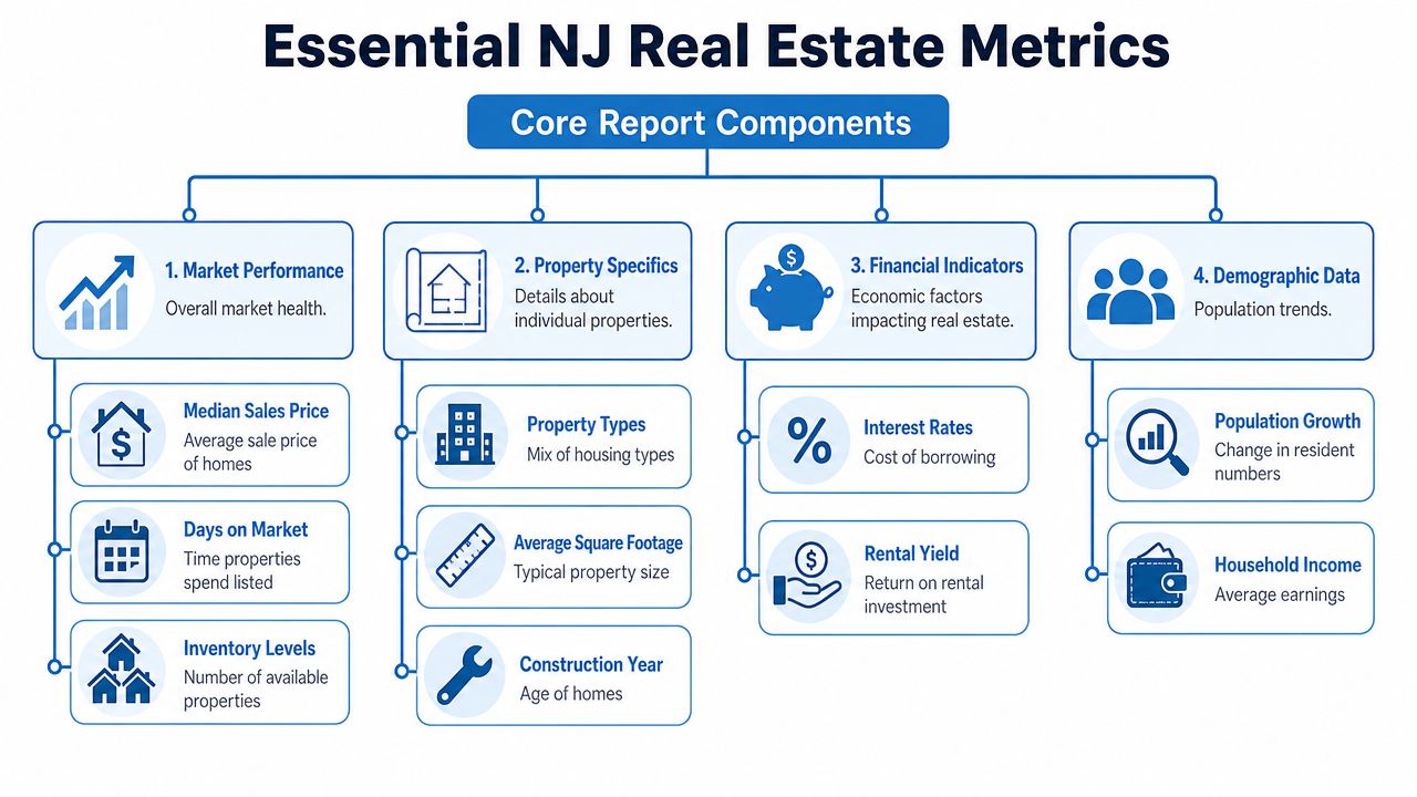
Essential metrics for an NJ real estate report
| Metric | What It Measures | Why It Matters (Signal) |
|---|---|---|
| Inventory levels | Active homes available for sale | Supply pressure and buyer choice |
| Days on market | Time listings stay active before selling | Pricing discipline and demand speed |
| Median sales price | Middle sale price in a market | Broad price trend without luxury skew |
| Average value or average sale price | Mean value across transactions or housing stock | Exposure to higher-end market composition |
| Price per square foot | Pricing normalized by size | Relative valuation across neighborhoods and asset types |
| New listings vs. closed sales | Supply entering versus transactions completing | Pipeline strength and likely direction of market pressure |
| Absorption rate | How quickly supply is being consumed | Whether inventory is tightening or loosening |
| County and ZIP segmentation | Local breakdown of all major metrics | Prevents statewide averages from masking local risk |
| Foreclosure and pre-foreclosure activity | Early distress and forced-sale pressure | Credit and downside risk monitoring |
| Building permit trends | New supply likely to enter later | Forward-looking inventory pressure |
| AVM confidence | Reliability range around model-driven values | Whether automation can support pricing decisions |
| Equity distribution | Owner equity depth across the market | Refinance capacity, seller flexibility, and default resilience |
The non-negotiable split between lagging and leading data
Most public discussion centers on lagging indicators. Median price, average sale price, and closed volume all matter, but they describe conditions after the transaction closes.
A stronger report also tracks leading indicators:
- New listings
- Permit activity
- Pre-foreclosure filings
- Price reductions
- Pending status velocity
- Equity stress signals
These metrics help analysts detect a shift before the median catches up.
How each metric answers a business question
Inventory and absorption
Inventory tells you what's available. Absorption tells you whether that inventory is clearing. Together they answer a simple question: Is supply rising because sellers are arriving, or because buyers are slowing down?
That distinction affects everyone. An investor may see new negotiation room. A lender may tighten assumptions around exit timing.
Days on market and pending velocity
Days on market is one of the fastest ways to spot friction. Rising DOM usually means one of three things: pricing is too aggressive, buyers have more options, or financing conditions are suppressing urgency.
Pending velocity adds a sharper operational read. A listing that goes pending quickly can coexist with a broader market where many homes linger. That's why aggregate and distribution views both matter.
Median, average, and price per square foot
These three get mixed together constantly, and that creates bad analysis.
- Median price is best for broad trend reading.
- Average value is more sensitive to premium inventory and market composition.
- Price per square foot helps compare local valuation across unlike homes, though it should never stand alone.
Use all three, but never ask one metric to do another metric's job.
Underwriting note: If median price rises while higher-tier activity softens, the market may be stronger in the middle than at the top. That's not obvious unless the report stratifies by segment.
Distress, permits, AVM confidence, and equity
These are the metrics that separate consumer reporting from institutional reporting.
- Foreclosure and pre-foreclosure activity can flag pockets of pressure before resale pricing visibly weakens.
- Building permits point to future supply. They're not perfect, but they're one of the few scalable forward-looking housing inputs.
- AVM confidence matters because a model output without confidence context is hard to operationalize.
- Equity distribution shows how much room owners have to sell, refinance, or absorb shocks.
What strong reports do differently
They don't just publish numbers. They organize them into decision layers:
- Market health
- Pricing structure
- Supply pipeline
- Credit and distress risk
- Micro-market variation
If your report lacks one of those layers, it's incomplete.
Where Does the Data Come From
Real estate data is fragmented by design. That's why two reputable platforms can describe the same market differently without either one being “wrong.”
Zillow's 2026 analysis reports an average New Jersey home value of $578,855, while other bodies report a median sales price of $525,000, according to Zillow's New Jersey home values page. That gap isn't a trivial discrepancy. It reflects different methodologies, definitions, and source pipelines.
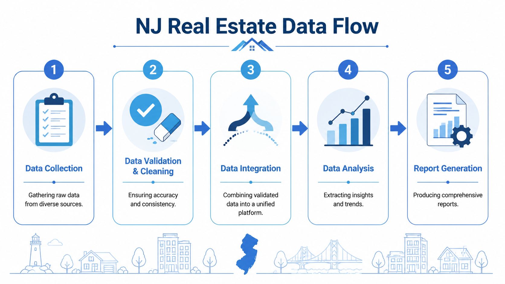
For a deeper look at sourcing complexity, this breakdown of where real estate data comes from is a useful reference.
The major source categories
Public records
County clerks, tax assessors, recorder offices, and court systems supply ownership, deed, lien, mortgage, tax, and distress data.
Their strengths are breadth and legal significance. Their weaknesses are latency, inconsistent formatting, and jurisdiction-by-jurisdiction variation.
MLS and listings feeds
Multiple Listing Services and listing aggregators provide active, pending, withdrawn, and sold listing data.
Here, analysts often get the freshest view of market activity, but access can be restricted, coverage can vary, and field standards are not perfectly uniform.
Aggregators and valuation platforms
These providers normalize data across geographies and often attach models such as estimated value, rent, equity, or risk scores.
That convenience has a tradeoff. Once data passes through multiple cleaning and modeling layers, analysts need to understand which fields are observed, which are inferred, and which are blended.
Why data hygiene matters more than source count
Teams often make the same mistake. They assume more feeds automatically mean better intelligence.
They don't.
A better system does four things well:
- Identity resolution: Matching the same property across messy source records
- Field standardization: Making county-specific labels comparable
- Update discipline: Pulling changes often enough to stay useful
- Conflict handling: Deciding what to do when one source disagrees with another
A report built on ungoverned feeds often produces false certainty. The dashboard looks polished while the underlying joins are weak.
Trust the report only if you can explain how the property record was matched, how often it refreshes, and which source wins when records conflict.
Why methodology changes the headline
The Zillow average value and the statewide median sales price answer different questions.
- An average home value captures a modeled estimate across the housing stock.
- A median sales price reflects the midpoint of actual transactions in a given period.
Those are both useful. They are not interchangeable. If an analyst compares them as if they describe the same thing, the report stops being diagnostic and starts being misleading.
What professionals should demand
A serious data workflow should let you trace:
- Origin
- Refresh timing
- Normalization logic
- Confidence level
- Coverage gaps
If your team can't audit those five points, it's not operating on a reporting platform. It's operating on a black box.
How to Interpret the Report for Your Business
Interpretation is where most market reports fail. They describe conditions but don't convert them into business action.
In May 2026, New Jersey posted a 3.2% decline in transaction volume, a 3.3% rise in median price, and an 8.5% rise in active inventory, according to Redfin's New Jersey housing market data. That combination signals a market correction toward greater balance, with inventory growth beginning to reduce buyer competition.
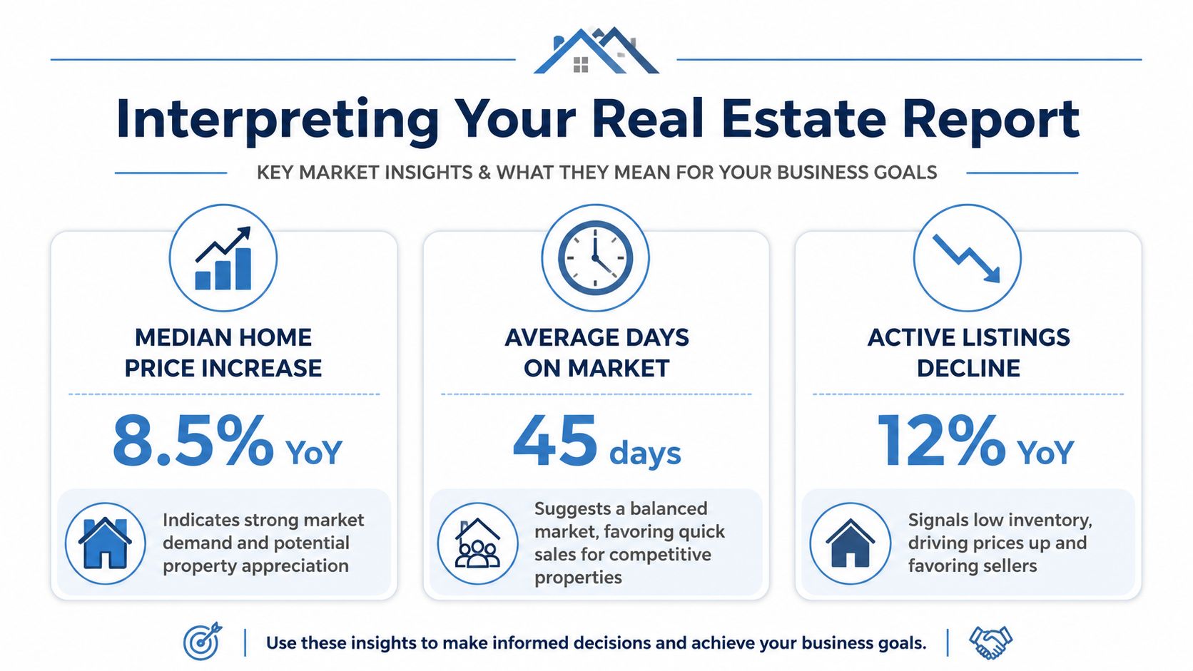
For investors
An investor should read that divergence as a selection market, not a blanket appreciation market.
Prices are still rising in the aggregate, but volume is softer and inventory is higher. That usually means returns depend more on buy discipline and submarket choice than on broad market momentum.
Use the report to isolate:
- Neighborhoods where inventory is rising faster than demand
- Price bands with persistent buyer pressure
- Asset classes where price growth is holding despite longer marketing times
A good companion framework is this guide to real estate investment analysis, which is useful for comparing market-level signals with deal-level underwriting.
For lenders and insurers
For a lender, the same data says something different. Risk hasn't disappeared, but pricing assumptions should become more conservative when volume falls and inventory rises at the same time.
Watch for these combinations:
| Signal Mix | Likely Interpretation | Operational Response |
|---|---|---|
| Price up, volume down, inventory up | Market still supported, but buyer urgency is weakening | Review appraisal support and exit timing assumptions |
| Inventory up in select geographies | Local pressure building before statewide averages show it | Tighten micro-market monitoring |
| Stable pricing with slower movement | Properties still clear, but only with correct pricing | Increase scrutiny on over-market collateral |
Portfolio insight: A market can remain price-resilient while becoming less liquid. Lenders should model both value risk and time-to-disposition risk.
For proptech teams
Product teams should treat these metrics as feature logic, not just market commentary.
Examples:
- A search portal can use inventory and DOM shifts to rank “hot” versus “cooling” areas.
- An AVM product can adjust confidence display when local turnover thins or segmentation widens.
- A portfolio monitoring tool can trigger alerts when a county shows rising supply plus slower closes.
The common mistake is pushing every user the same market summary. Users don't need more dashboards. They need decision-ready context tied to their workflow.
The practical reading framework
When you review an NJ real estate report, ask four questions in order:
- What is the price trend?
- What is the liquidity trend?
- What is the supply trend?
- What does this mean for my specific exposure?
If the answers point in different directions, don't force a simple story. Mixed signals are often the actual story.
How to Automate NJ Real Estate Reporting with a Data Platform
Manual reporting breaks first on speed, then on consistency.
Analysts pull MLS exports, county files, listing feeds, and valuation snapshots into spreadsheets. Then they reconcile addresses, standardize fields, patch missing records, and rebuild charts for the next reporting cycle. The result is usually stale by the time stakeholders read it.
Automation changes the workflow from document production to signal management.
What an automated stack should do
A modern reporting system should:
- Ingest multiple real estate data feeds
- Normalize property identity across sources
- Refresh market indicators on a defined schedule
- Push outputs into dashboards, PDFs, or APIs
- Trigger alerts when thresholds break
This isn't unique to housing. In banking, the same principle appears in tools that automate bank financial reports, where teams replace manual compilation with governed, repeatable pipelines.
The difference between static and dynamic reporting
A static report answers, “What happened last month?”
A dynamic platform answers stronger questions:
- Which ZIP codes just saw inventory pressure change?
- Which target areas now show more distress risk?
- Which loans sit in neighborhoods with weakening liquidity?
- Which acquisition markets deserve a pricing review today?
That's the operational upgrade. The report stops being an archive and becomes a monitoring layer.
The fastest team usually doesn't win because it has better analysts. It wins because the analysts spend less time assembling data and more time evaluating exceptions.
How the workflow should look
A practical setup usually follows this sequence:
- Connect source feeds through APIs or scheduled deliveries
- Standardize fields for listings, ownership, value, and distress
- Define business rules for alerts and segmentation
- Publish outputs to internal dashboards or customer-facing products
- Log revisions so users can trust historical comparisons
If you're evaluating architectures for this kind of workflow, this guide on automated real estate market reports with data MCP workflows is worth reviewing.
A short product walkthrough helps clarify what an API-first setup looks like in practice:
Where automation pays off
Automation matters most when your team needs:
- Cross-county coverage
- Frequent refresh cycles
- Consistent historical comparisons
- Embedded reporting inside software products
- Alerting instead of manual monitoring
At that point, spreadsheets aren't lean. They're the bottleneck.
What Are the Standard Distribution Formats and Cadences
The best report fails if the delivery format doesn't match the user.
Format should follow workflow
Use the format that fits the decision.
- PDF reports work for board reviews, lender committees, and monthly executive summaries.
- Interactive dashboards fit analyst teams that need filters by county, ZIP, price band, or asset type.
- API feeds are the right choice for portals, underwriting systems, servicing tools, and internal applications.
A good NJ real estate report often exists in all three forms. The difference is not the data. It's the consumption layer.
Cadence should follow volatility
Choose frequency based on how fast the underlying signal changes.
| Cadence | Best For | Most Useful Inputs |
|---|---|---|
| Weekly | Acquisition teams, active investors, lead-gen operations | New listings, price cuts, distress signals |
| Monthly | Lenders, brokers, market analysts | Inventory, volume, pricing, DOM |
| Quarterly | Portfolio managers, executives, insurers | Equity trends, geographic exposure, strategic shifts |
If the user acts on short-cycle supply changes, monthly is too slow. If the user reviews concentration risk, weekly can create noise.
The standard is simple: deliver fast-moving indicators more often, and structural indicators less often. That keeps the report actionable instead of exhausting.
If your team needs property, ownership, valuation, permit, lien, and market data in a format that can support live NJ reporting, BatchData is built for that job. It gives investors, lenders, insurers, and proptech teams a cleaner path from fragmented property records to operational dashboards, API workflows, and portfolio monitoring.