
Heat maps are a game-changer for real estate analysis, offering a visual way to identify market trends like price growth, rental yields, and buyer demand across geographic areas. By using real estate APIs, you can generate these maps quickly and keep them updated with real-time data. APIs provide access to property details, sales history, demographics, and more, making it easy to create detailed and accurate visualizations.
Key Takeaways:
- What is a Heat Map? A color-coded tool that highlights data intensity, such as sale prices or vacancy rates, across a specific region.
- Why Use APIs? They streamline data collection, provide real-time updates, and allow for layering additional context like school ratings or transit access.
- How to Build One: Define your goals, gather accurate data through property enrichment (e.g., sale prices, lot sizes), and choose the right visualization style (choropleth or point-density maps).
- Best Practices: Use reliable data sources, automate updates, and validate data to maintain quality.
Heat maps powered by APIs help investors and real estate professionals make faster, data-driven decisions by turning complex data into actionable insights.
Planning Your Heat Map: Data and Design Basics
Defining Your Business Questions and Goals
Before diving into data collection, it’s crucial to define the exact questions you want to answer. Think of specific insights you need, such as: Which ZIP codes have the highest rental yields? or Where are prices appreciating the fastest quarter over quarter? Maybe you’re looking for neighborhoods with affordable single-family homes under $350,000. These kinds of targeted questions shape every decision you’ll make – what data to collect, the geographic units to analyze, and the map styles that best present your findings.
As Tab Tab Labs explains:
"When you turn raw data into a visual story, you empower clients to make faster, more confident decisions." – Tab Tab Labs
For instance, you might start with questions like:
- Where are undervalued areas in a metro region? (and how can you skip trace property owners to reach them?)
- Which neighborhoods show cooling buyer demand?
- How can local comparable sales back up a pricing strategy?
Each question leads to a unique map with its own data layers. Once you’ve nailed down your questions, you can identify the specific data points needed to create meaningful visualizations.
Core Data Requirements for Heat Maps
Every heat map hinges on two essential data components: location (like an address or coordinates) and value (e.g., sale price, price per square foot, rental yield). These values are what drive the color gradients on the map – showing trends like days on market or average rental returns. Without accurate location and value data, the map simply won’t work.
To add depth to your analysis, include contextual layers. Factors like school ratings, crime statistics, zoning regulations, and transit access can highlight why certain areas stand out. Or as Tab Tab Labs puts it:
"A heat map is only as good as the data you feed it. Garbage in, garbage out." – Tab Tab Labs
Here’s a breakdown of key data categories and where to find them:
| Data Category | Specific Data Points | Source Examples |
|---|---|---|
| Market Value | Sale price, list price, price/sq ft, rental yield | County recorder, MLS, BatchData |
| Contextual | School ratings, crime rates, zoning, transit access | GreatSchools, municipal planning departments |
| Demographics | Population density, income levels, migration trends | U.S. Census Bureau, Esri |
To keep your maps reliable, make sure tax and assessment records are updated regularly – ideally daily or weekly. Once your data is set, you’re ready to choose the best geographic units and map styles for your project.
Selecting Geographic Units and Map Styles
With your data and goals defined, the next step is aligning your geographic units to match your real estate API’s capabilities. For residential analysis, Census ZCTAs (ZIP Code Tabulation Areas) provide consistent boundaries. Broader comparisons might call for county-level data, while hyper-local insights benefit from census tracts or even individual parcels.
Choosing the right map style is equally important. A choropleth map is great for showing macro trends, like median sale prices or foreclosure rates, by shading entire areas (ZIP codes, counties, etc.) based on average values. On the other hand, a point-density map is better for micro-level insights, plotting property coordinates with color intensity to highlight clusters – like areas with distressed properties or high-yield rentals.
Here’s a practical tip: lower the opacity of the heat layer so the underlying street map remains visible. This adds critical geographic context, helping clients orient themselves and trust the insights they’re seeing.
sbb-itb-8058745
Big Heatmap Tutorial | Maplibre, Mapbox, Leaflet, Google Maps | Proximity, Weighted, and Cell

Integrating Real Estate APIs into Your Workflow
How to Build a Real Estate Heat Map with APIs: Step-by-Step Workflow
Setting Up a Data Pipeline with Real Estate APIs
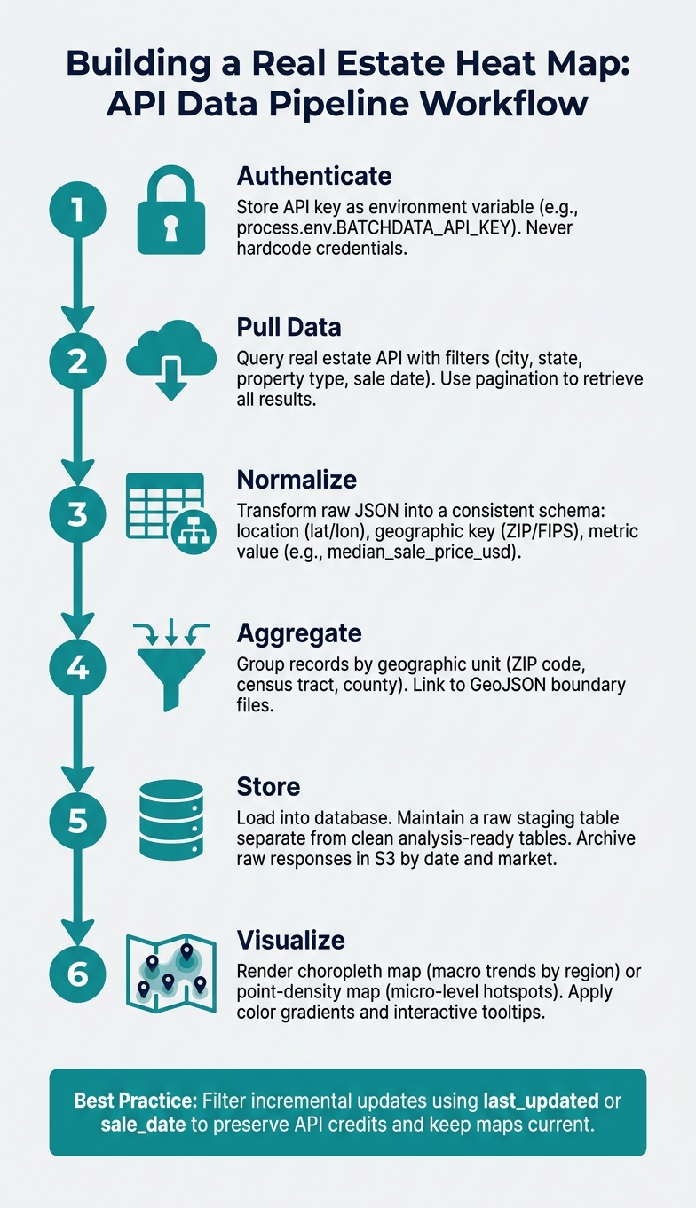
Once you’ve outlined your data requirements and geographic units, the next step is creating a pipeline to seamlessly move API data into a format compatible with your mapping tools. This process typically follows a straightforward sequence: authenticate → pull → normalize → aggregate → store → visualize.
Start by securing your API credentials. Instead of hardcoding them into your source files, store your API key in an environment variable, such as process.env.BATCHDATA_API_KEY. This practice enhances security and simplifies updates. Next, build a lightweight client to handle the API’s base URL, timeouts, retries, and error responses, making debugging easier.
When your data starts coming in, you’ll need to transform the raw JSON into a consistent internal schema. To make records ready for mapping, ensure each includes:
- A location (latitude/longitude or a geocodable address)
- A geographic key (ZIP code, census tract FIPS, or county FIPS)
- A metric value (e.g.,
median_sale_price_usd,cap_rate, oravg_days_on_market)
Aggregate these records according to your chosen geographic unit, link them to boundary shapes (like GeoJSON files for ZIP codes or census tracts), and either load the results into your database or export them to your visualization tool.
Here’s a tip: maintain a raw staging table separate from your clean, analysis-ready tables. This setup allows you to reprocess historical data if your aggregation logic changes, without needing to re-query the API. It saves both time and API credits while ensuring your pipeline is efficient and adaptable for data enrichment tasks with BatchData.
Using BatchData for Property Data and Enrichment

BatchData is an excellent choice for building heat maps because it combines property search, property enrichment, and contact enrichment into a single API, simplifying your workflow.
For instance, if you’re creating a price heat map for a metro area like Phoenix, AZ, you could structure a BatchData property search request with filters such as "city": "Phoenix", "state": "AZ", "property_type": "single_family", and a sale_date_from value to focus on recent transactions. Use pagination (page and page_size) to retrieve all results. Then, map BatchData’s response fields to your internal schema like this:
| BatchData Response Field | Internal Schema Field |
|---|---|
property.location.lat | latitude |
property.location.lon | longitude |
property.last_sale.price | sale_price_usd |
property.last_sale.date | sale_date |
property.building.area_sq_ft | building_sq_ft |
If some records are missing critical details – like square footage, year built, or owner status – BatchData’s property enrichment API can fill in the gaps using an address or APN (Assessor’s Parcel Number) as the matching key. This step is crucial before aggregating spatial data, as incomplete records can skew geographic averages and distort heat map gradients. Additionally, BatchData offers contact enrichment and skip tracing, enabling you to overlay owner demographics (e.g., absentee owners or high-equity holders) as an extra data layer on your map.
By enriching your data first, you can address API limitations and ensure your records are as accurate and complete as possible.
Managing API Rate Limits and Cleaning Your Data
Dealing with API rate limits is a common challenge when working with real estate APIs. The easiest way to handle this is to batch your requests, cache results locally, and avoid re-querying unchanged records. For incremental daily updates, filter your API requests using fields like last_updated or sale_date to pull only new or modified data, rather than the entire dataset. This approach helps preserve your API credits while keeping your heat map up-to-date with market trends.
To maintain data quality, validate each record by checking geocode accuracy, standardizing addresses, and filtering out statistical outliers. Ensure geocodes are present and have an acceptable confidence score – low-confidence coordinates can misplace properties into the wrong ZIP codes. Use USPS abbreviations and consistent formatting to standardize addresses, ensuring smooth geographic joins. Watch out for extreme outliers, like a $12,000,000 sale in a neighborhood where the median is $280,000, as these can distort visualizations. Apply minimum sample size rules or cap extreme values to address this.
Finally, archive raw API responses by date and market in object storage (e.g., S3) for future reference. If a data quality issue arises later, you can trace it back to the original API response without needing to re-fetch the data. This practice adds an extra layer of reliability to your workflow.
Building and Styling Your Heat Map
How to Build a Choropleth Heat Map
A choropleth map uses color shading to represent data across geographic regions, such as ZIP codes, counties, or census tracts. For example, it might display metrics like median sale price or days on market. To create one, you’ll need to link cleaned API data with geographic boundary files.
In U.S. real estate, it’s better to use ZIP Code Tabulation Areas (ZCTAs) instead of USPS ZIP codes. ZCTAs, maintained by the Census Bureau, offer stable polygon boundaries that remain consistent over time. Pair these with TIGER/Line shapefiles or GeoJSON files, and join your data records using a shared key – typically a FIPS code or ZCTA identifier.
Once your data is connected, assign colors based on the value ranges for each region. For continuous metrics like price per square foot, stick to a single-hue sequential color scheme (e.g., light to dark blue) to keep things clear. Use diverging palettes (like red-to-blue) for data with a meaningful midpoint, such as year-over-year appreciation, where zero represents no change.
"Real estate price heatmaps aren’t just interesting data visualization – they’re essential market analysis tools that create better real estate outcomes through geographic price intelligence." – Atlas Team
To make your map interactive, add mouseover events that highlight region borders and display tooltips. These tooltips can show detailed metrics like average sale price, foreclosure rates, or verified owner data, turning a static map into a dynamic tool for decision-making.
How to Build a Point-Based Density Heat Map
Point-based density maps are a great complement to choropleth maps. Instead of shading regions, these maps plot individual property locations and create a "heat" effect based on how closely points cluster. This approach is ideal for identifying hotspots that cross administrative boundaries, like a high-activity corridor spanning multiple ZIP codes.
Start by using latitude and longitude data from your API records. Adjust two key settings to control the map’s layer: radius (how far each point’s influence spreads) and intensity (the weight of each point, which can be tied to metrics like sale price). For a broad metro area like Dallas-Fort Worth, a radius of about 0.5 miles works well, keeping clusters distinct without spilling over into neighboring zones.
Adding dynamic filters – such as toggles for property type, price range, or recent transaction dates – makes the map more user-friendly. Lowering the heat layer’s opacity ensures that underlying map details, like streets, transit stops, or school district boundaries, remain visible, giving users more context for the data.
U.S. Formatting and Display Conventions
Once your heat map is ready, follow U.S. formatting standards to ensure clarity and avoid misinterpretation. Consistent labeling and display conventions are key to creating a reliable tool for market analysis. Here’s a quick reference for applying these standards:
| Metric Category | U.S. Standard | Application in Heat Maps |
|---|---|---|
| Currency | USD ($) with commas | Sale prices, rental yields, tax assessments (e.g., $485,000) |
| Area (Building) | Square feet (sq ft) | Price per sq ft analysis, living area size |
| Area (Land) | Acres or square feet | Lot size, zoning density |
| Distance/Radius | Miles | Proximity to amenities, transit, or schools |
| Geography | ZIP / ZCTA / FIPS | Boundary definitions for choropleth layers |
| Market Timing | Days on Market (DOM) | Visualizing demand velocity |
For color schemes, a green-to-red gradient works well with U.S. audiences: green typically indicates lower or more affordable values, while red highlights high-value or high-activity areas. Additionally, format currency tooltips with a dollar sign and commas as thousand separators, avoiding decimals for whole-dollar figures (e.g., $1,250,000 instead of $1250000.00). Use the MM/DD/YYYY format for any dates shown on the map, such as time ranges or data freshness indicators.
Running and Maintaining Heat Map Workflows Over Time
Automating Data Updates and ETL Processes
Once your data integration is set up, automating updates becomes essential to keep your heat map relevant. Timely updates ensure the map reflects current conditions. For fast-changing metrics like days on market or new listings, schedule daily API pulls. Slower-moving data, such as tax assessments or ownership records, can be updated weekly.
For larger datasets, bulk delivery methods like S3 or Snowflake are more efficient. If real-time interaction is needed, consider viewport-based data loading – using tools like the idle event in Google Maps – to fetch only the data visible on the screen. This method helps maintain smooth performance as your dataset grows.
After pulling data, automate processes to validate, check completeness, and timestamp records. If your dataset exceeds 10,000 property points, use server-side aggregation to avoid browser performance issues when rendering. These steps ensure your heat map stays accurate and responsive over time.
Once updates are automated, shift your focus to monitoring data quality and tracking key changes.
Monitoring Data Quality and Tracking Changes
Even a single bad data point can disrupt your analysis. For example, an incorrect sale price or mismatched FIPS code might skew an entire ZIP code’s color band without raising an obvious error. As BatchData explains:
"A single bad data point can invalidate an entire analysis."
To prevent this, integrate automated anomaly detection into your workflow. Flag outliers and validate them against recent trends. If your pipeline includes forecasting, backtest it to confirm it accurately reconstructs historical data from the past 12–24 months before relying on it.
Keep an eye on leading indicators like building permit activity, tax delinquency filings, and pre-foreclosure notices. These often shift 60–90 days before changes appear in closed-sale data, giving your heat map a predictive edge.
Your monitoring dashboard should prioritize data freshness by source, field completion rates by region, and week-over-week changes in key metrics like median price per square foot and inventory levels. These quality checks ensure your heat map remains reliable and actionable.
Access Control, Scalability, and API Key Management
To maintain the reliability of your workflows, effective API key management and role-based access are a must. Use restricted API keys in production, and assign separate keys for development, staging, and production environments. This protects production quotas and minimizes risk.
For team use, implement role-based access. Analysts can view and filter maps, while only engineers or data leads should have permissions to refresh bulk data or adjust pipeline configurations. Regularly monitor API usage dashboards – weekly reviews can help you catch unusual spikes, which could indicate a runaway scheduled job or a misconfigured listener.
BatchData sums up the evolving focus in data-driven decision-making:
"The question has shifted from, ‘Is this a good deal?’ to ‘What does the data say about this deal’s risk, potential, and portfolio fit?’"
Conclusion: Using Heat Maps to Drive Real Estate Decisions
Creating an effective heat map boils down to three key elements: accurate, well-processed data, the right visualization approach, and a workflow that adapts over time. When these elements come together, your heat map transforms from being just a static image into a powerful, ongoing decision-making tool. This connection between data, visualization, and adaptability ties seamlessly into the steps outlined earlier.
The process begins with defining a clear business objective – whether you’re spotting key market trends or uncovering new opportunities. Knowing your goal shapes both the data you gather and how you present it. By tapping into BatchData’s advanced data solutions, heat maps can capture the nuances of real market conditions. For example, choropleth maps can reveal median price variations, while point-density maps can spotlight areas ripe for real estate investing. On the technical side, setting up API pipelines, choosing precise geographic units, and automating ETL (Extract, Transform, Load) processes ensure your maps remain accurate and scalable. By turning raw data into a compelling visual narrative, clients can make quicker and more informed decisions. In fact, studies suggest this approach can significantly boost conversion rates.
The real estate industry is moving from simply describing data to predicting outcomes. This shift is made possible by the strategies discussed here. Heat maps that rely on dependable API data, are maintained through automated systems, and are safeguarded with secure access controls provide the foundation for this evolution.
FAQs
Which real estate metrics are best for creating heat maps?
When it comes to real estate heat maps, some metrics stand out as particularly useful. Property prices, average sale prices, and market trends are among the top indicators. These metrics help identify areas that are either undervalued or command higher values, making them essential for shaping effective pricing strategies.
Other key factors include proximity to amenities, school ratings, and new developments. These elements shed light on a location’s appeal and livability. By layering these data points onto geographic visuals, complex market data becomes much easier to interpret. This approach enables professionals and clients alike to make smarter, well-informed decisions.
How do I choose between a choropleth map and a point-density map?
A choropleth map is perfect for displaying aggregated data across specific regions, such as neighborhoods or zip codes. This type of map can highlight trends like average property prices, making it easier to identify patterns across larger areas.
On the other hand, a point-density map provides a closer look at individual property locations or activity hotspots. This makes it ideal for pinpointing detailed distributions or identifying concentrated areas of interest.
Both map types can be enhanced with geospatial tools and APIs, such as those from BatchData, to create effective real estate heat maps. These tools add precision and functionality, making your visualizations even more insightful.
How can I keep my heat map accurate while avoiding API rate limits?
To keep your heat maps accurate and avoid hitting API rate limits, it’s crucial to plan your data requests thoughtfully. Focus on specific areas or property types to narrow your queries. Combining multiple requests into a single API call can also help streamline the process. Additionally, implementing data caching is a smart way to minimize redundant queries.
Using tools like Postman can make it easier to track and analyze your usage patterns. Lastly, always stick to API usage guidelines – respect rate limits and consider scheduling your requests during off-peak hours to maintain smooth and uninterrupted access.