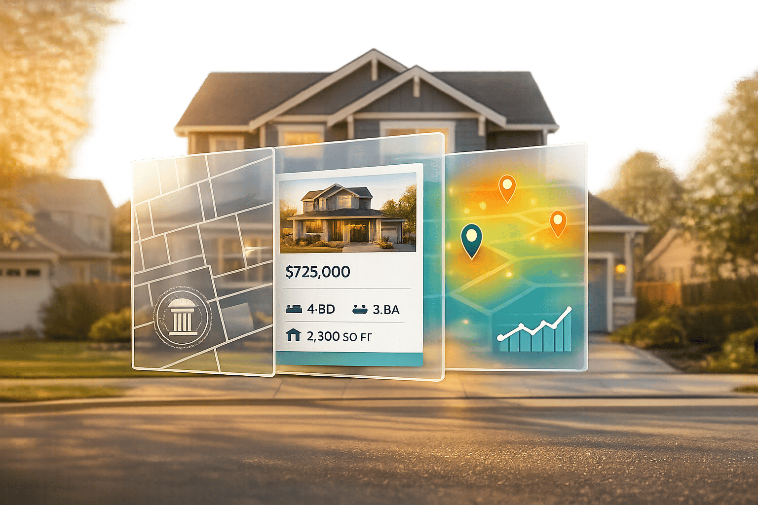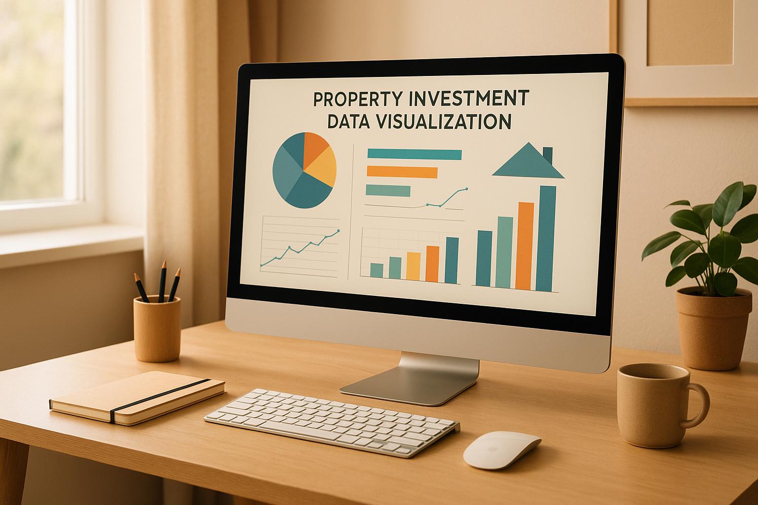
Want quick, smart decisions when you buy property? Data tools change hard-to-read real estate info into simple charts, graphs, and boards. These help you see patterns, match up places, and pick wisely without sifting through lots of numbers. Here’s why they are key and how they work:
- Main numbers like cap rate, cash flow, and rent-to-price ratio show up as visuals like bar charts, heat maps, and scatter plots.
- Pluses are: spotting risks, following patterns, and finding the best times to buy or sell.
- Best tools are: spreadsheets for easy change, CMA software for matching properties, and sites like BatchData for deep info on places.
Quick Tip: Pick the right chart for each number – bar charts to compare, line graphs for patterns, and heat maps for place views. Use clear visuals with strong tips to make the most out of your real estate money.
Real Estate Analytics: A Complete Power BI Dashboard
Key Measures and Graph Types for Property Review
When you put money into property, you need sure numbers close by. The right figures, along with clear pictures, can let you make quick, wise moves.
Key Figures for Property Picture Use
Cap Rate (Capitalization Rate) is very key. It shows how much you get back each year, in percent, found by the net money made divided by how much the property costs. For example, an 8% cap rate means a property gives you $8,000 back each year for every $100,000 put in. This figure is often seen on maps with colors – green spots mean more money back, while red areas show less.
Cash Flow keeps track of the money left each month after all costs. Line charts show these money trends over time, letting buyers see if a place keeps giving back money. More money coming in than going out is good, less means you pay out of your own pocket. Many tools also buzz you when money drops too low.
Cash-on-Cash Return looks at yearly return to the cash put in. For example, if you put in $25,000 and get $3,000 back each year, your return is 12%. Bar charts are good for seeing this figure across many places, helping spot the best ones.
Internal Rate of Return (IRR) is a bit tougher. It finds the yearly growth rate where the net value of an buy hits zero. Charts that compare help here, showing IRR with simpler figures like cap rate. A place with an IRR over 15% often points to a good buy chance.
Market Value Trends show how property costs change in areas over time. Heat maps can show area trends, while line graphs show changes as they happen. These tools help buyers find rising areas before costs go up too much.
Rent-to-Price Ratio ties monthly rent to buy cost, shown in percent. A ratio over 1% suggests good rent money can be made, while below 0.5% may show a too pricey market. Scatter plots are great for seeing how this ratio changes by type and area.
Best Graph Types for Real Estate Data
Picking the right graph for each figure can help a lot in seeing your data.
- Bar Charts: Great for side-way looks, like cap rates, cash flow, or rent money across different spots or markets. They show difference in how well places do at a glance.
- Line Graphs: Best for watching changes over time, be it property values, rent rates, or market moves. You can even put many lines on one chart to compare different spots or types of places.
- Scatter Plots: Great for finding links between two things. For example, putting property age next to rent money might show that a bit older places often give better returns due to lower costs.
- Heat Maps: A good way to show info like home costs, crime, or school scores. These maps use colors to show levels – dark red might mean high home costs, while light yellow points to cheaper places – making it easy to check out different areas fast and in a clear way.
- Pie Charts: Handy for showing what makes up your portfolio or how you split your costs. For example, you can see how much of your money is in houses versus flats or what part of your rent money covers different bills. It’s best to keep the pieces under six for easy understanding.
- Waterfall Charts: Useful for showing what adds up to your total earnings. You might start with the full rent income, then take away taxes, upkeep, and other bills to find your clear profit. Each part shows as its own bar, so you know clearly where your cash is going.
Having the right chart for each detail helps your data paint a clear picture. Bar charts are great for side-by-side comparison, line graphs for spotting trends, and heat maps for seeing where things are. A wrong chart can hide key info or make your data tough to read. Picking the right one means you can sort your info better and make smart money moves.
BatchData: Easy Real Estate Data Help

Good data is key to trusty check-ups. Bad data can mess up even the best-looking graphs. BatchData fixes this with rich data sets that backers can rely on.
What BatchData Does
BatchData has a strong set of tools for each step of checking real estate deals. At its core is property data enrichment, which boosts basic property info with deal history, market worth, and key records. This rich data sets the base for making on-point compare charts.
For those after off-market chances, BatchData’s skip tracing and contact enrichment tools find property owners and their contact info. Plus, the property search API lets users pull property data on their own, making data gathering swift across many markets.
More great bits are phone number checks to keep data right and bulk data send-outs for big projects. For backers with many properties, BatchData can make custom data sets aimed at chosen investment targets and areas.
The service uses a pay-as-you-go plan, so users only pay for the data they use. This makes it work well for both small-time backers and big firms with lots of data needs.
How BatchData Makes Visualization Better
BatchData does more than just give data – it makes your check-up steps run smooth and fast. By making property records standard, like address styles, property types, and money facts, the platform cuts out the slow task of data cleaning. This steadiness is key for making right and good-looking charts.
With API setup, rich data goes right into your chosen tools for making pictures. Things like cap rates and cash flow guesses come ready to use. Whether you’re making scatter plots to look at rent gains by property age or heat maps to show cap rates in areas, BatchData makes sure your pictures show true market moves.
For market compare, the platform’s rich datasets have deep property facts, making sharp compares possible. This detail makes sure your charts and graphs tell the whole story, with trusty data.
BatchData’s help goes past just giving data. Their team can help set up custom data flows that keep your check-up steps up to date with new property info. This means your charts and reports stay new without you having to update them by hand, letting you focus on seeing trends and making smart choices.
sbb-itb-8058745
Tools to Check and Compare Rental Properties
When you get the right ways to measure and type of charts, special tools can boost your property checks a lot. These tools turn basic property info into useful points, making it easy for investors to spot good chances to make money. Whether it’s spreadsheets or certain software, having these tools makes checking properties more quick and exact.
Using Spreadsheets for Rental Property Analysis
Spreadsheets are key for looking at properties. They let you have full control over how you sort and check info, letting you fit calculations for your investment way. From money flow guesses to checking many properties, spreadsheets do all.
One big plus is how they adapt to US-specific measures. You can put in property prices in US dollars, work out returns by square feet, and keep track of monthly rent money with auto formats. Built-in ways make it easy to work out main rates like price-per-square-foot and cap rates, giving you a clear look at how properties are doing.
Want to see trends? Spreadsheets have chart choices like bar graphs, line graphs, and scatter plots that show changes in money flow, rent profits, or property value fast.
Another big plus is how you can change them. You can change basic setups to add auto calculations that refresh when you change things like interest rates or rent prices. This allows you to try different cases and see how they change your money returns.
The top change comes from linking spreadsheets with extra data. By connecting to more property info, you can auto-refresh and make your checks more right. This cuts out the need to put in data by hand, lowers mistakes, and saves you time.
For those who want more auto help, Comparative Market Analysis (CMA) software is a great next step.
Comparative Market Analysis (CMA) Software
CMA software builds on what spreadsheets do but lifts property checks much higher. These tools pull similar sales data, current market ads, and property details to make side-by-side checks that are both full and simple to get.
What makes CMA software stand out is how it makes property data regular. It changes for differences in things like square feet, lot size, and property age, making sure your checks are right and fair.
The real worth of CMA software is in its time-saving auto help. Instead of looking for similar properties by hand, the software sorts it out for you. It finds right matches based on place, size, and type, then makes pro reports you can use to decide or show to partners.
These reports are a key plus. Most CMA tools make neat documents with charts, maps, and summary lists, making it easier to share your findings and show investment chances to people involved.
CMA software fits well with other money tools. It links to land records so you can see full pasts, who owns what, and market moves. This link makes your study better and helps you pick well. When joined with deep land info from places like BatchData, CMA tools give you clearer views on how the market and lands are doing.
How to Show Property Data Well
When you know the main things to look at and have picked the best chart types, the next thing is to show your data in a way that makes for smart, quick investment choices. A good visualization changes plain numbers into useful tips, more so in property investments. These tips will let you show market trends and chances well.
Making Simple, Strong Charts
Start with the easy stuff: make all labels clear. Use the US money style (e.g., $250,000) for money amounts, write square footage as "sq ft", and show monthly rent as "$2,500/month." This helps your crowd get the facts fast.
Use colors that stay the same:
- Green for good cash flow
- Red for bad cash flow
- Blue or gray for other data
Just use up to four colors in your chart. Too many colors can mix up and put off readers.
Look at your chart’s scale. For example, if you are looking at property values from $180,000 to $220,000, set the y-axis to begin at $160,000. This makes it easy to see the differences.
Name charts well. Instead of a broad name like "Property Comparison", use "Monthly Cash Flow: Oak Street vs. Pine Avenue Properties (2024-2025)." A good title tells readers just what they are seeing and gives them more info.
When showing changes over time, think about using a trend line. For example, a trend line on a property value chart can show if prices in a place are going up or down, helping investors make choices at the right time.
Think about phone users too. Many investors look at property data on their phones. Use fonts that are at least 12 points and make sure charts can be seen well on small screens.
After your charts show the data trends, sum up the main points in a short report to pull it all together.
Making Reports with Key Info
A good report starts with clear charts and adds useful tips. Match your charts with a one-page summary that shows the most key points. For example: "Property A makes $340/month more cash flow than Property B, but Property B might go up in value more in the long run, based on the area trends."
Use tables to compare main things side by side. Keep the style the same – use percentages for cap rates and US money for cash flows – to make it easy to compare.
Spotlight big points with data callouts. For example, if a property’s cap rate is 2% more than the usual, show this big by using bold text or a highlighted box. These callouts point to the main info without making readers go through all the data.
Split your report into parts for risks and chances:
- Risks: Add details like, "Property C is in a flood zone, costing $180/month more in insurance."
- Chances: Note good things like, "Property D is two blocks from a new metro station set to open in 2026."
Always put the market setting first. For example, don’t just say a property is $200 per square foot – note that the area’s average is $185 per square foot. This lets folks see if it’s a good buy or too costly.
End every report with clear steps to take. From your study, give tips like, "Book a check-up for Property A by March 15" or "Ask for payment terms from Property B’s seller." This makes your ideas into clear tips.
Keep reports short: two pages max for one property, four pages for area checks. Long reports tend to be ignored, mostly when folks are looking at lots of options. Stick to facts that help with choices and skip what does not help.
Conclusion
Picking the right tools to show data can really help your choices in investing in property. Using clear, well-made charts and true data, you can make sense of complex market trends and use them for profitable choices. At the core of every good investment is data that is both on time and right, showing how key it is to have info you can trust.
Good visuals need good data, and tools like BatchData help make sure your data fits well to keep your charts right. Even the best-looking graphs are no good if their property info is old or missing. Here is where BatchData’s top real estate data comes in. Their tools for searching and their custom data sets give fresh, full property info that merges well with your daily tasks – whether you’re looking at rental trends in sheets or making market reports.
Showing data turns plain numbers into clear, useful tips. Your charts should lead you to smart and sure choices in investment. With right data and undisturbed visuals, you can spot chances quickly, steer clear of big mistakes, and grow a more fruitful property list.
To start, aim to pick the best chart types, keep your designs plain, and show the data with enough market detail to back smart choices. Using the right tools, sharp data, and wise ways will help you do well in the busy real estate market.
FAQs
How do tools for seeing data help folks know when to buy or sell homes?
Tools that let you see data turn hard market info into easy, clear tips for property buyers. With these tools, buyers can spot trends, look at changes in home prices by area, and check past results in simple visual ways.
By seeing trends – such as changes in the market by season or places set to grow – buyers can make smart choices based on data about when to buy or sell. This helps them grab chances and skip big errors, lifting their overall win in investing.
Why use BatchData for looking at property for investment?
BatchData gives property buyers top tools to check and weigh up chances by using a huge list of over 150 million U.S. property files. With new, full data sets, users can look at properties, know their value, and learn about the market – letting them act quick and sure.
What makes BatchData stand out from old ways is its focus on always having fresh and full info. By pulling in updated data via APIs, BatchData allows for guessing future trends, making lead finding easy, and creating smart, data-based plans. This way helps investors move fast and with high care, making sure their choices are both right and smart.
What are the best ways to show data about property money-making like cap rate and cash flow?
To show data on things like cap rate and cash flow in property, some good graph choices are bar charts, scatter plots, and line charts.
- Bar charts are great for looking at different groups, like types of properties or places. They let you see how one group does next to another quickly.
- Scatter plots help when you need to look at how things relate, like how cap rate goes with cash flow.
- Line charts are good at showing changes over time, which is useful if you want to keep track of how things are doing or see trends in the market.
These tools make it easy to take in complex data, helping people buying property see trends fast and make wise choices.