In today’s fast-paced real estate and PropTech sectors, effectively managing and visualizing property data has become crucial for informed decision-making. With the increasing availability of tools like Power Query and Power BI, professionals can now simplify complex datasets, create actionable insights, and present clear outcomes to stakeholders. This guide breaks down the process shared in a recent session on using Power Query and Power BI to transform property leasing data into a dynamic, interactive dashboard.
Whether you’re a real estate analyst, investor, or tech-savvy data enthusiast, this article will show you how to clean, structure, and visualize property data, empowering you to achieve operational efficiency and data-driven insights.
The Challenge: From Static Data to Dynamic Insights
Many real estate professionals are familiar with the challenges of working with static property data, such as leasing schedules, rental figures, and occupancy reports. Typically presented in formats like PDFs or static tables, these datasets can be difficult to analyze and share effectively. The process often involves manual effort, complex formatting, and a lack of scalability.
The goal, as discussed in the video, was to turn a leasing schedule containing detailed property rents, vacancies, and tenancy information into a user-friendly, interactive Power BI dashboard. This transformation enables stakeholders to explore timelines, key performance indicators (KPIs), and patterns more intuitively and efficiently.
sbb-itb-8058745
Step-by-Step: Cleaning and Preparing Data for Visualization
1. Extract Data from PDF to a Machine-Readable Format
The first step involves extracting data from a PDF, such as a leasing schedule. While Power BI offers a built-in PDF reader, the video recommends using AI tools like Microsoft Copilot or ChatGPT for more accurate conversion. The extracted data can then be saved as a CSV for further processing.
2. Load Data into Power BI

Open Power BI Desktop and import the prepared CSV file. This step creates a local copy of the dataset, ensuring that no changes are made to the original file.
3. Transform the Dataset Using Power Query

Power Query is an essential tool within Power BI for cleaning and shaping data before visualization. Key transformations include:
- Promoting Headers: Ensure column headers are correctly identified.
- Replacing Placeholder Characters: Replace symbols like dashes used to indicate blanks with null values for consistency.
- Converting Data Types: Ensure each column (e.g., dates, currency, text) is assigned the correct data type. Use the "Using Locale" feature to convert British-style dates or currencies into a U.S.-compatible format.
- Splitting or Extracting Text: Simplify text fields (e.g., extracting categories like "A" or "B" from "Cat A" and "Cat B").
Pro Tip: Power Query records every transformation step, allowing easy traceability and reproducibility.
Building the Dashboard: Bringing the Data to Life
Once the data is clean, the next step is to create interactive visuals that provide value to stakeholders.
1. Define Clear KPIs
Start by identifying the most important metrics to display prominently. In this case, key metrics included:
- Total annual rent
- Average rent per square foot
- Vacancy rate
Power BI "Card" visuals are ideal for presenting these metrics in a bold, easy-to-read format. Calculations like weighted averages (e.g., rent per square foot) require creating measures using DAX expressions. For instance, to calculate the weighted average rent:
Average Rent per Square Foot = SUM([Rent]) / SUM([Area Square Feet]) This approach ensures accurate and dynamic reporting.
2. Create a Gantt Chart for Lease Timelines
A Gantt chart enables stakeholders to visualize lease start and end dates across different properties. While Power BI doesn’t have a native Gantt chart, the visual can be downloaded from the Power BI Marketplace.
Challenges and Solutions:
- Vacancy Handling: Vacant properties lacked start and end dates. The workaround involved assigning placeholder dates (e.g., the earliest and latest dates in the dataset) to ensure vacancies appeared on the timeline.
- Interactivity: Use slicers (fancy filters) to allow users to dynamically explore leases based on criteria like fit-out types or rent ranges.
3. Enhance Visualizations with Tooltips
Tooltips in Power BI can provide additional information when users hover over a visual, such as details about a specific property, rent figures, or square footage. This adds granularity without cluttering the dashboard.
Ensuring Accuracy: Double-Check the Numbers
Throughout the process, it’s crucial to validate the results against the original data. For example:
- Does the total rent match the sum in the source PDF?
- Are averages calculated correctly (e.g., weighted averages vs. simple averages)?
This step ensures the integrity of your analysis and builds confidence among your stakeholders.
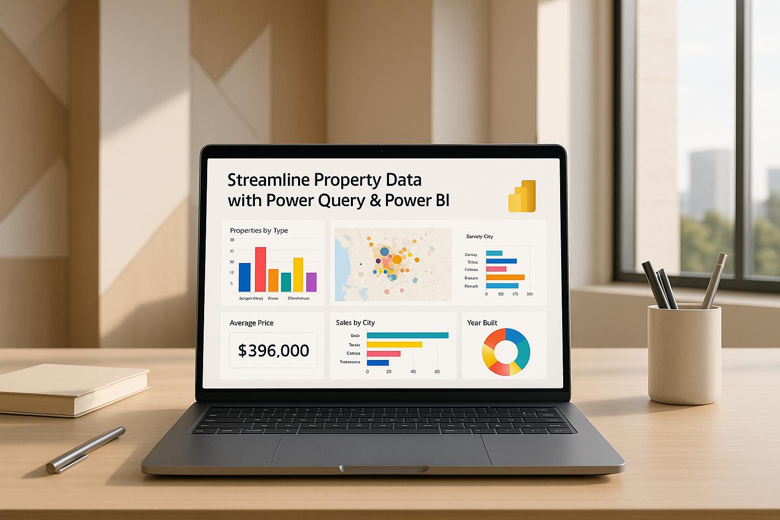
The Final Output: An Interactive Dashboard
The completed Power BI dashboard provided a comprehensive overview of leasing data, including:
- High-level KPIs for rent, vacancy, and average rent per square foot
- An interactive Gantt chart showing lease timelines
- Slicers for filtering data by fit-out types, rental terms, or other dimensions
This transformation allowed stakeholders to move beyond static tables and gain actionable insights into leasing trends, timelines, and performance indicators.
Key Takeaways
Here are the most valuable lessons and actionable insights from using Power Query and Power BI for property data:
- Automate Data Cleaning: Use Power Query to streamline data cleaning, replacing manual processes like hiding columns or reformatting dates in Excel.
- Always Validate Results: Double-check calculated metrics (e.g., totals, averages) against the original dataset to ensure accuracy.
- Use Measures for Precision: When calculating metrics like weighted averages, create DAX measures to avoid errors and ensure consistency.
- Leverage Visuals for Clarity: Replace static tables with interactive charts and cards to make data digestible and actionable for stakeholders.
- Customize Tooltips and Filters: Enable deep dives into the data through dynamic filters and tooltips without overwhelming users.
- Work with Dates and Formats Carefully: When handling international datasets, use locale-specific settings to properly format dates and currencies.
- Iterate and Improve: Power BI’s step-by-step transformation tracking lets you experiment and refine your visuals without losing progress.
Conclusion
By leveraging tools like Power Query and Power BI, real estate professionals can transform static leasing data into actionable dashboards that enable smarter decision-making. The ability to automate workflows, ensure accuracy, and present data in a visually compelling way is a game-changer for businesses seeking a competitive edge.
With these insights and step-by-step guidance, you can start building dynamic property dashboards that turn complex datasets into powerful storytelling tools for your team and stakeholders.
Source: "Streamlining Real Estate Data with Excel, Power Query & Power BI" – Bayfield Training, YouTube, Oct 14, 2025 – https://www.youtube.com/watch?v=FQ3Q8ws4jIM